Logitech G | Design Language System
Intro
A flexible, scalable, and adaptable design language system designed to meet the needs of our users using industry trends and best practices. It empowers users to be familiar with a UI through minimal new learned behaviors.
Goal
To enable our team of designers, developers and partners in the Logitech G family to create, recreate, modify or iterate on independent software products in a quick and efficient manner. The end product will align holistically with the Logitech G brand.
My Role
Visual UX designer. I’m working with another VUX designer, an Interaction designer, and a design technologist to design, build and document our design language system.
Opportunities
Efficiency
No need to re-create work
Product Consistency
SW will develop a common thread
Collaboration
Access to a common library for team members
Accessibility
Aim for a minimum of WAG2.0 compliance
Best Practices
Leverage common interactions & patterns
Principles
Trustworthy
to foster a relationship built on quality, reliability, & integrity.
Inclusive
to facilitate a welcoming, accessible engagement.
Faceted
to accommodate users behavioral modes and activities.
Curated
to empower users with contextualization and personalization.
Bite-sized
to provide an experience with flexible access and digestible tasks.
Integrated
to expand digital touchpoints with an enriched ecosystem.
The Application of the DLS
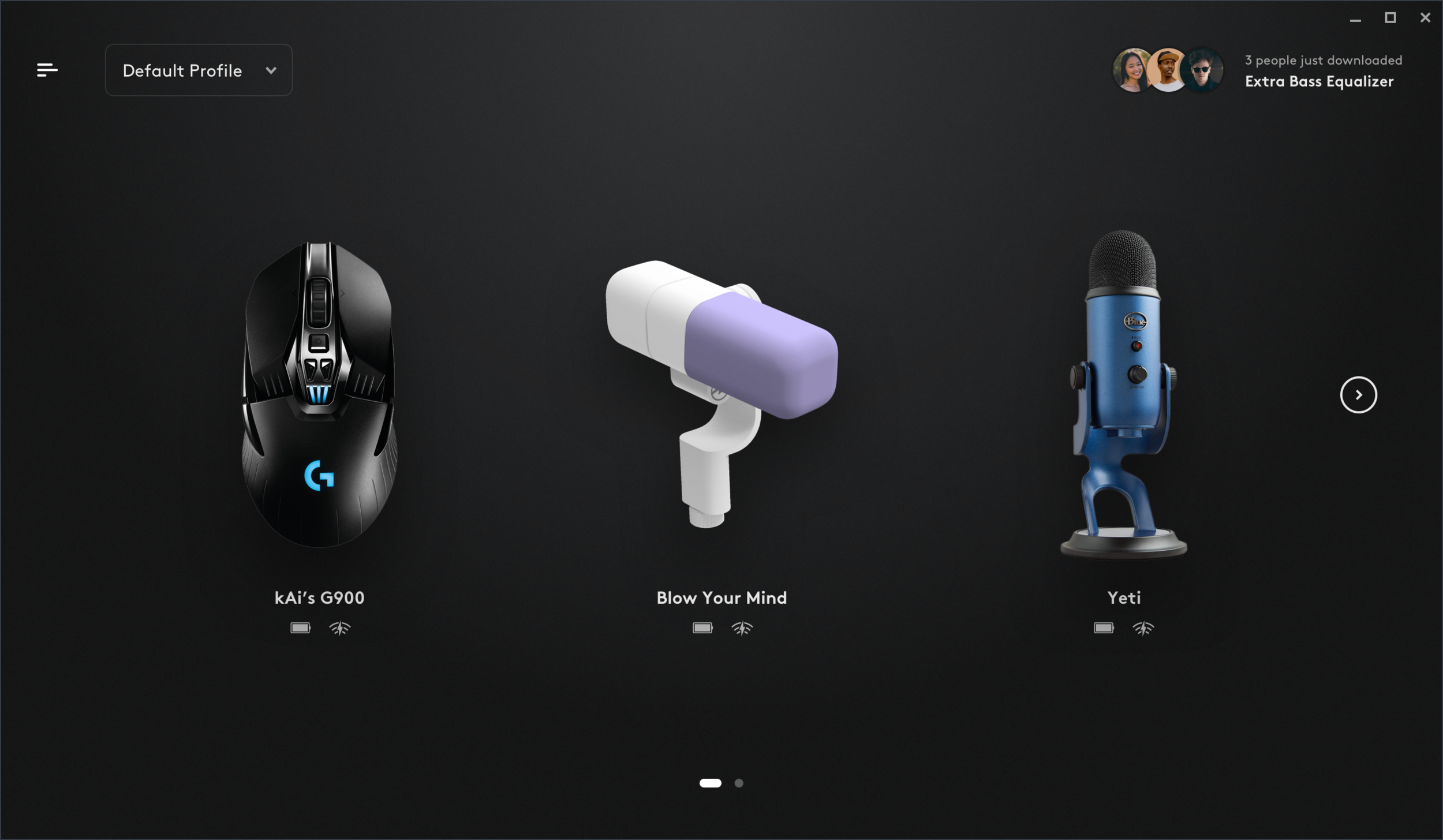
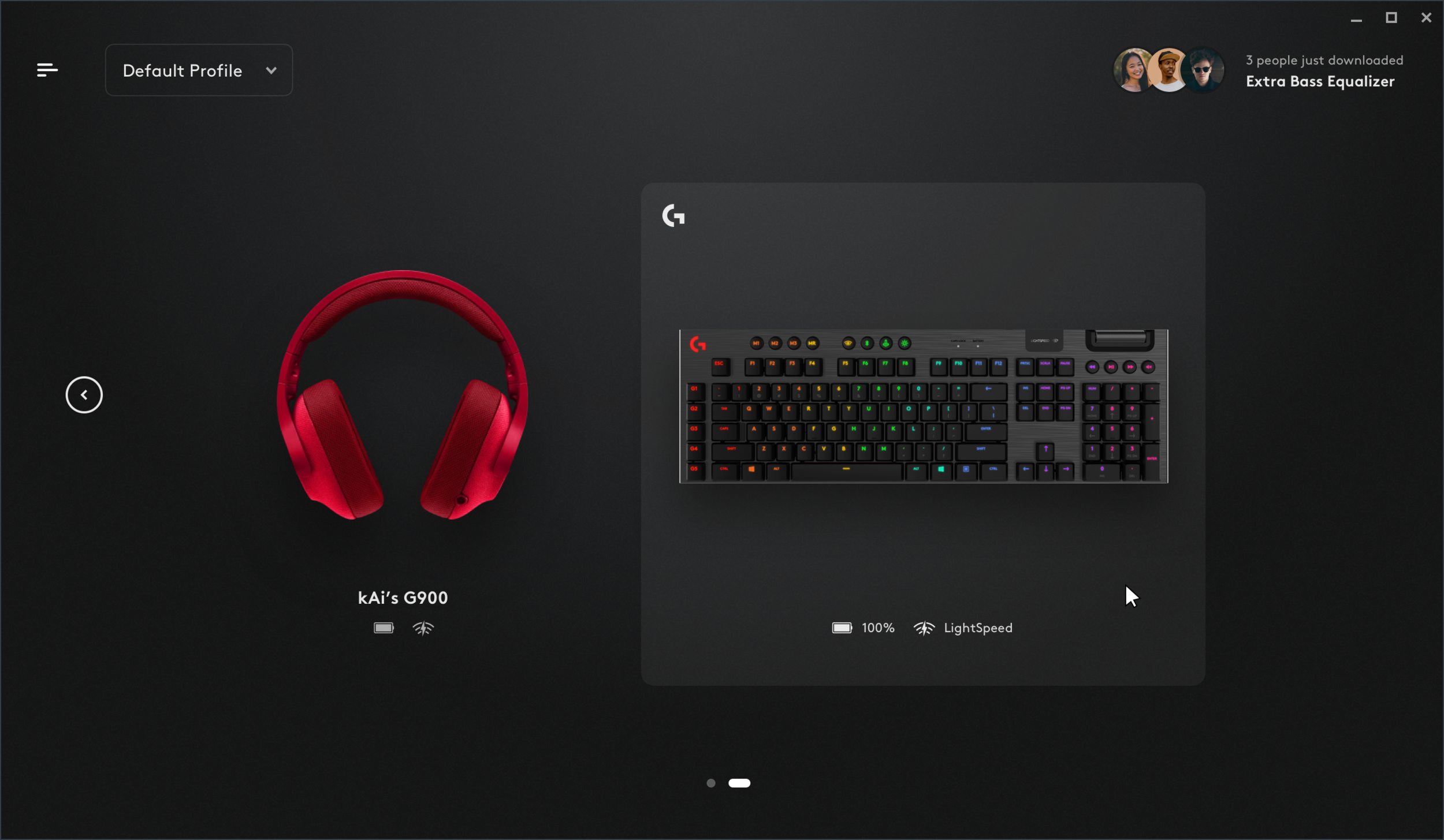
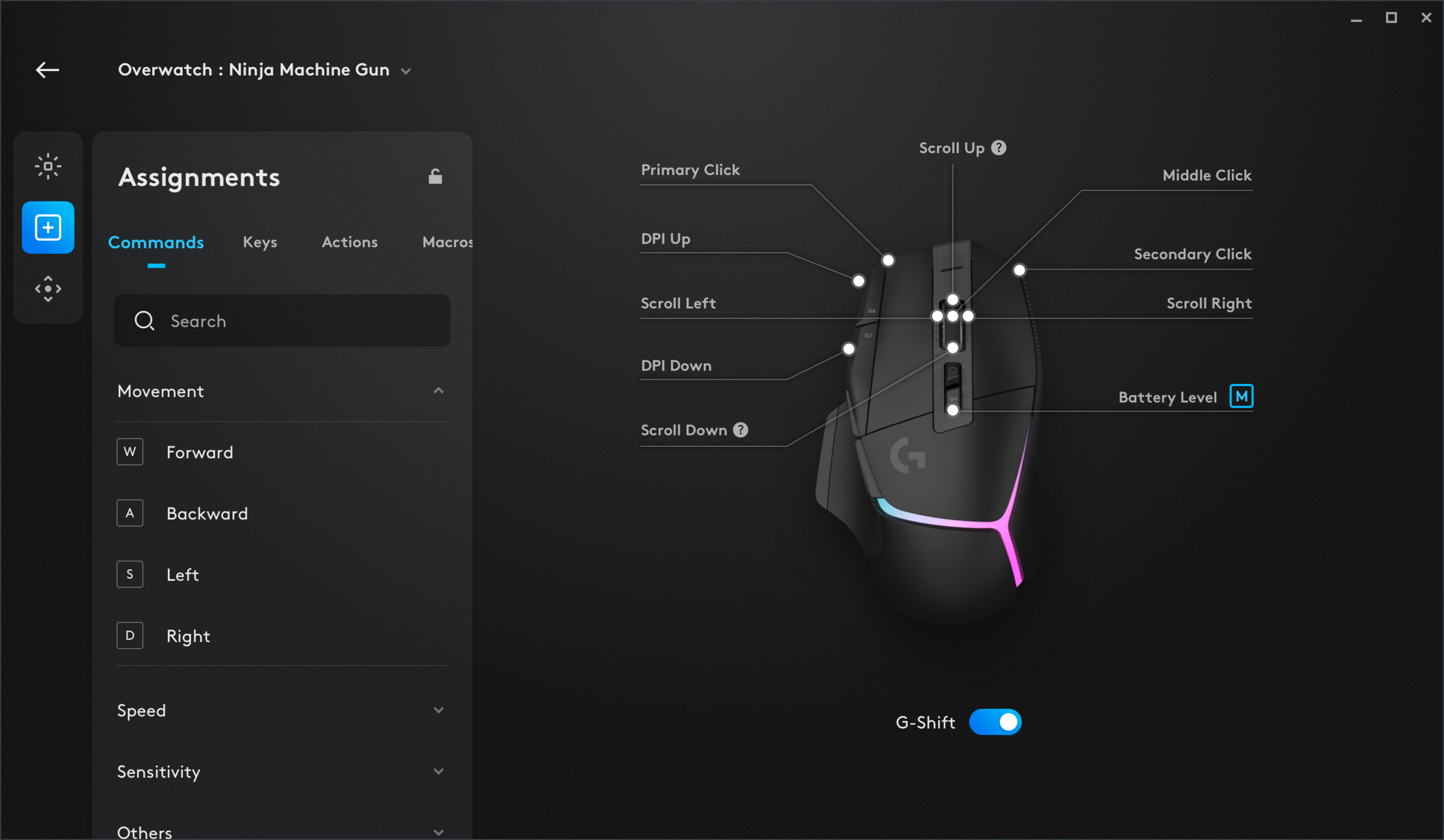
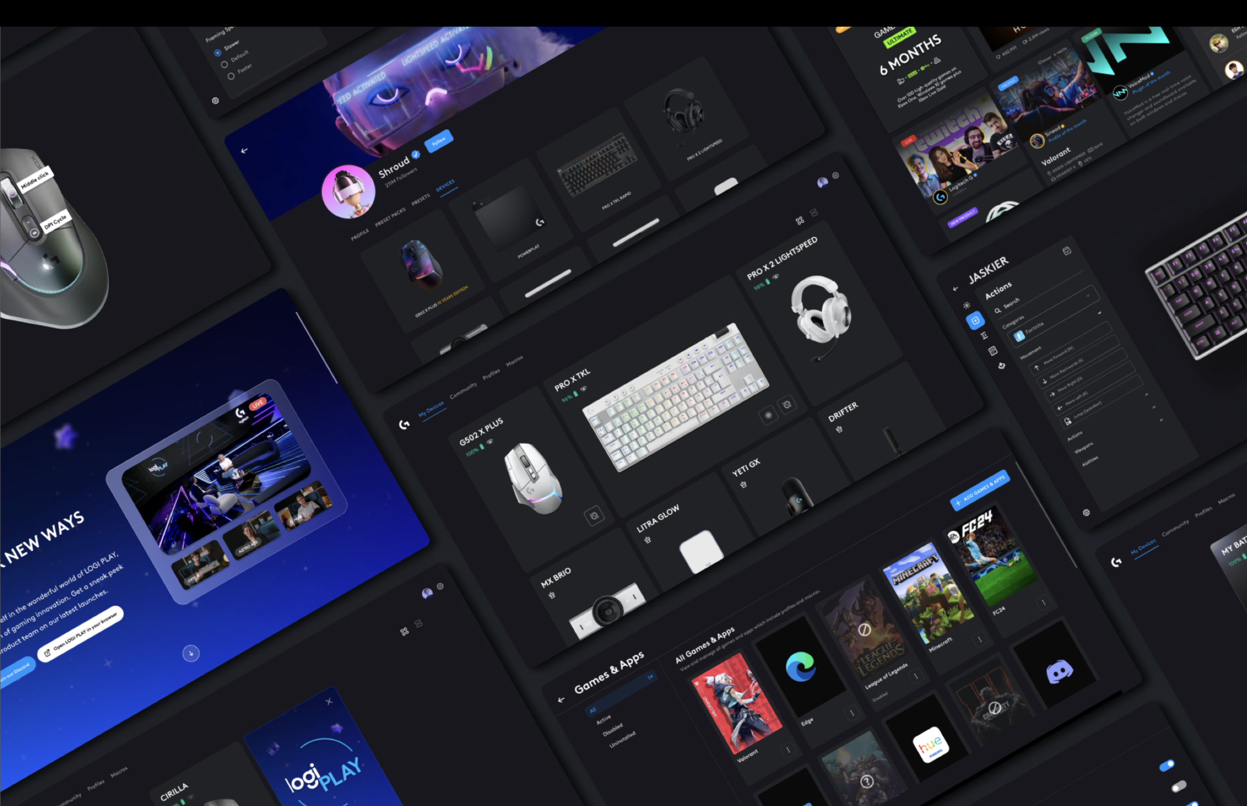
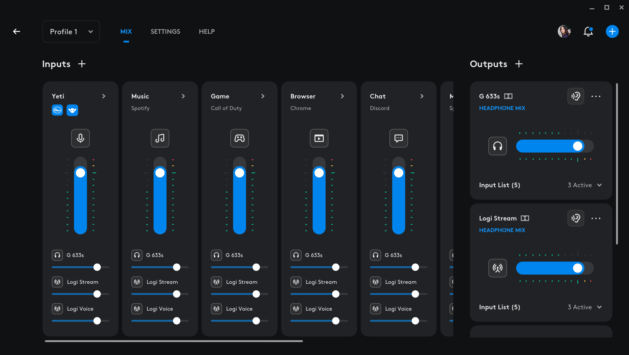
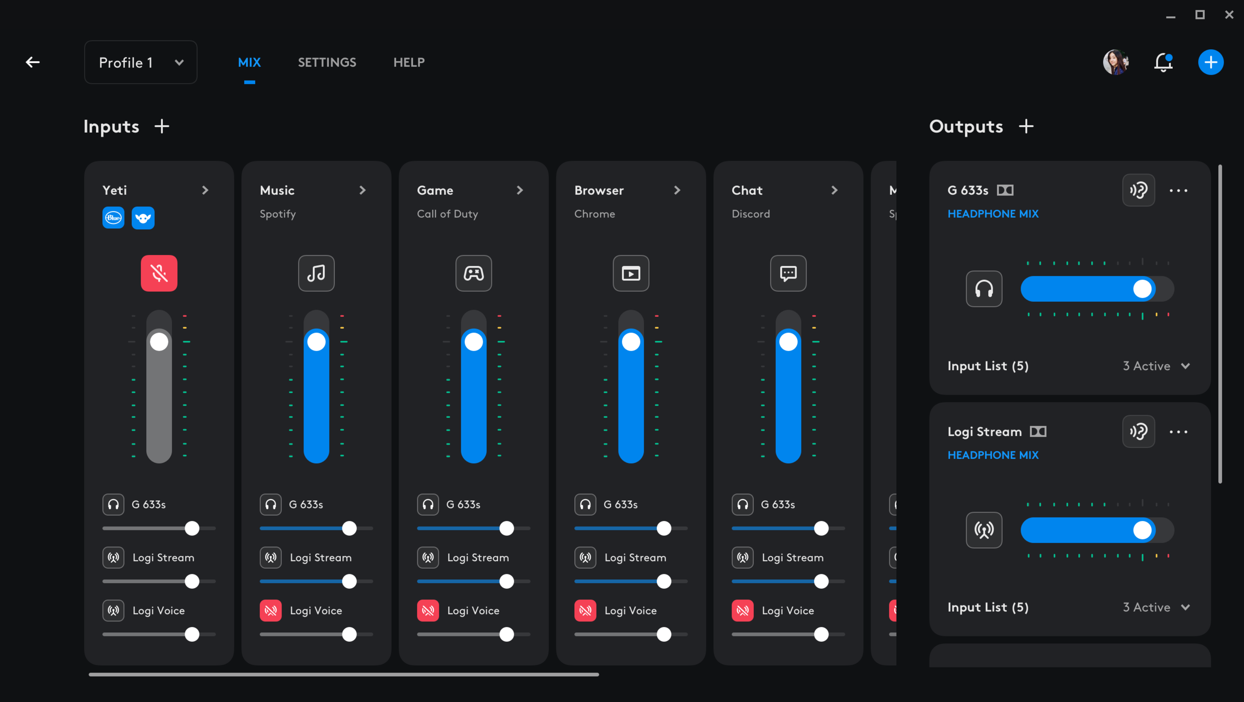
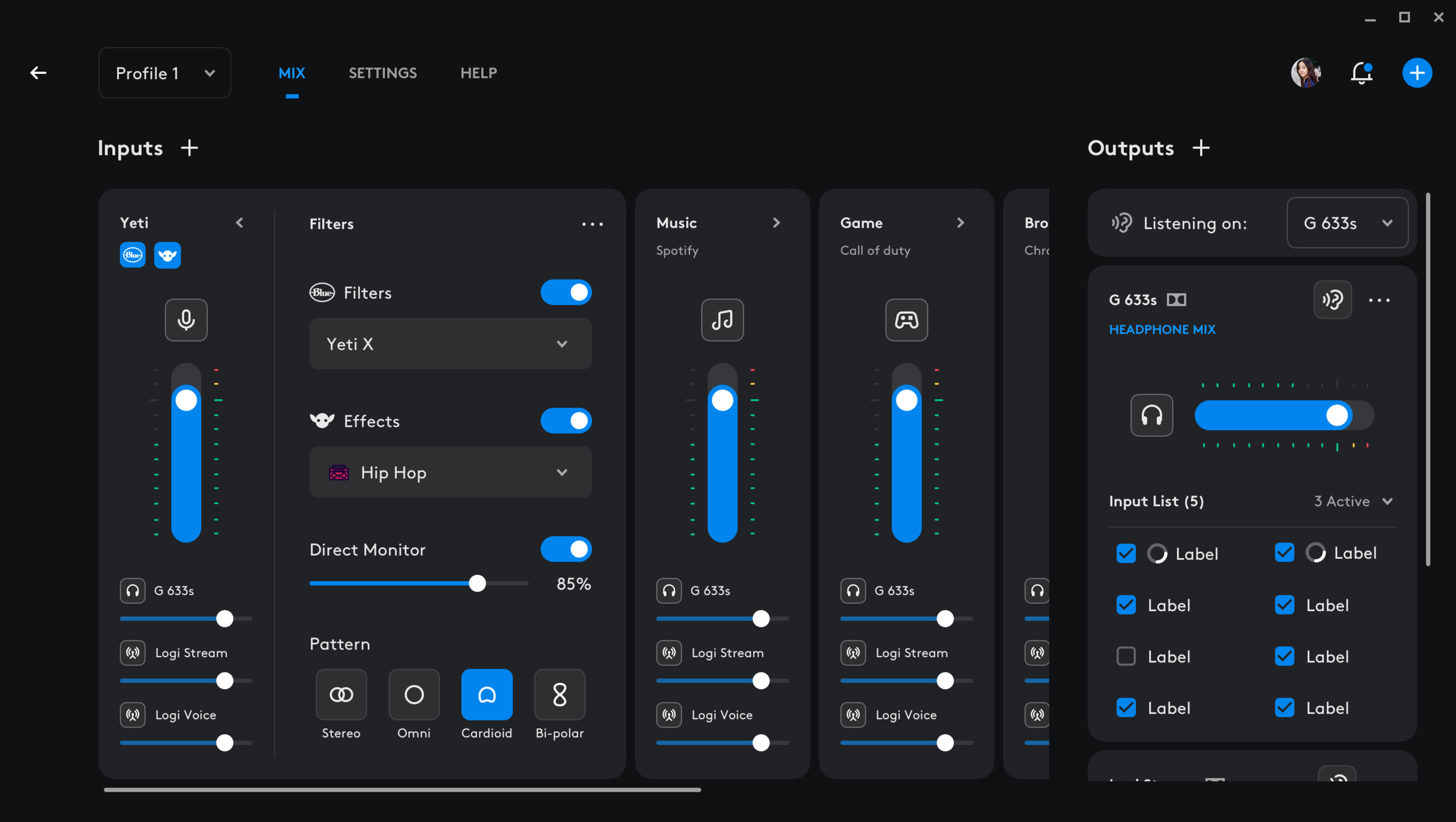
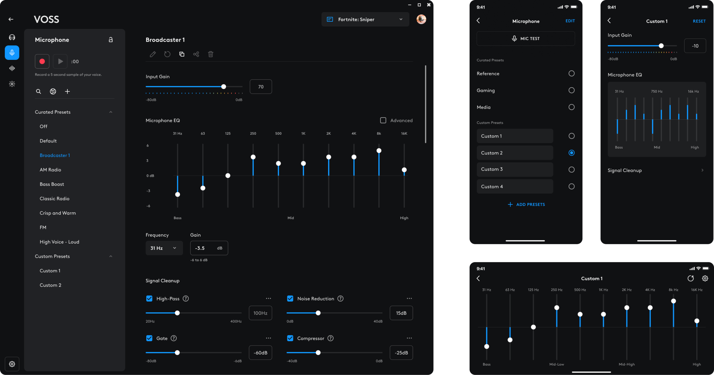
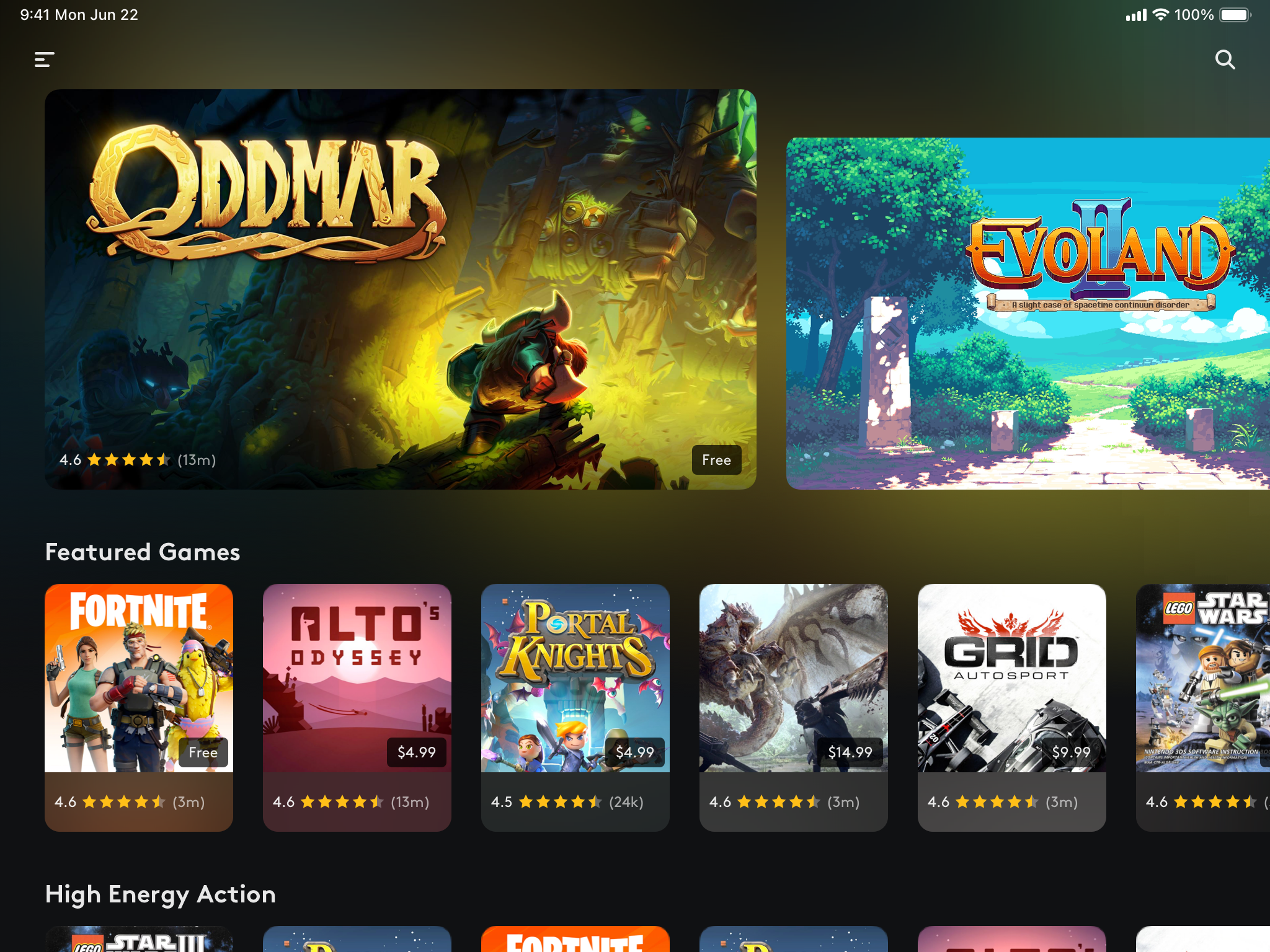
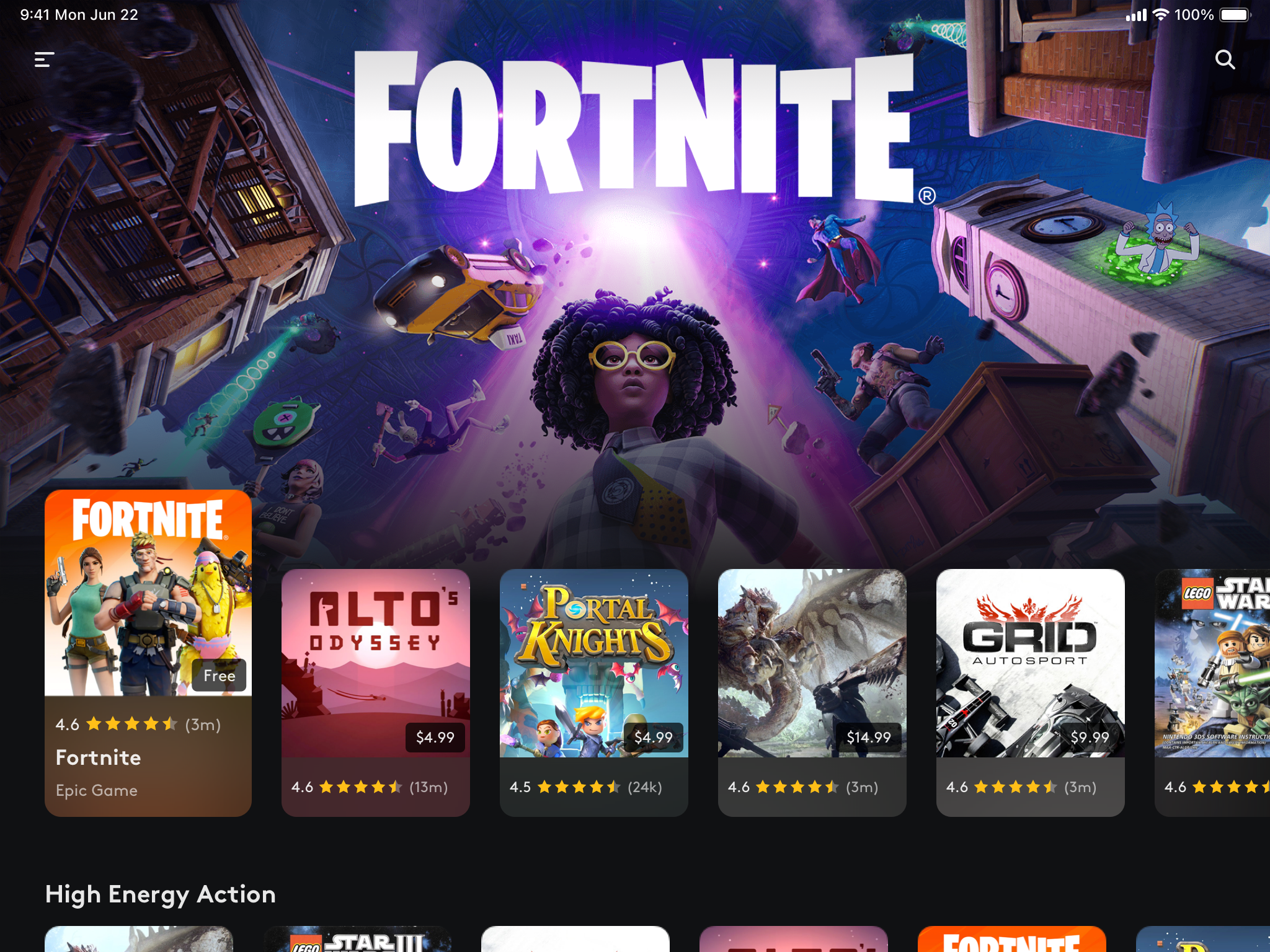
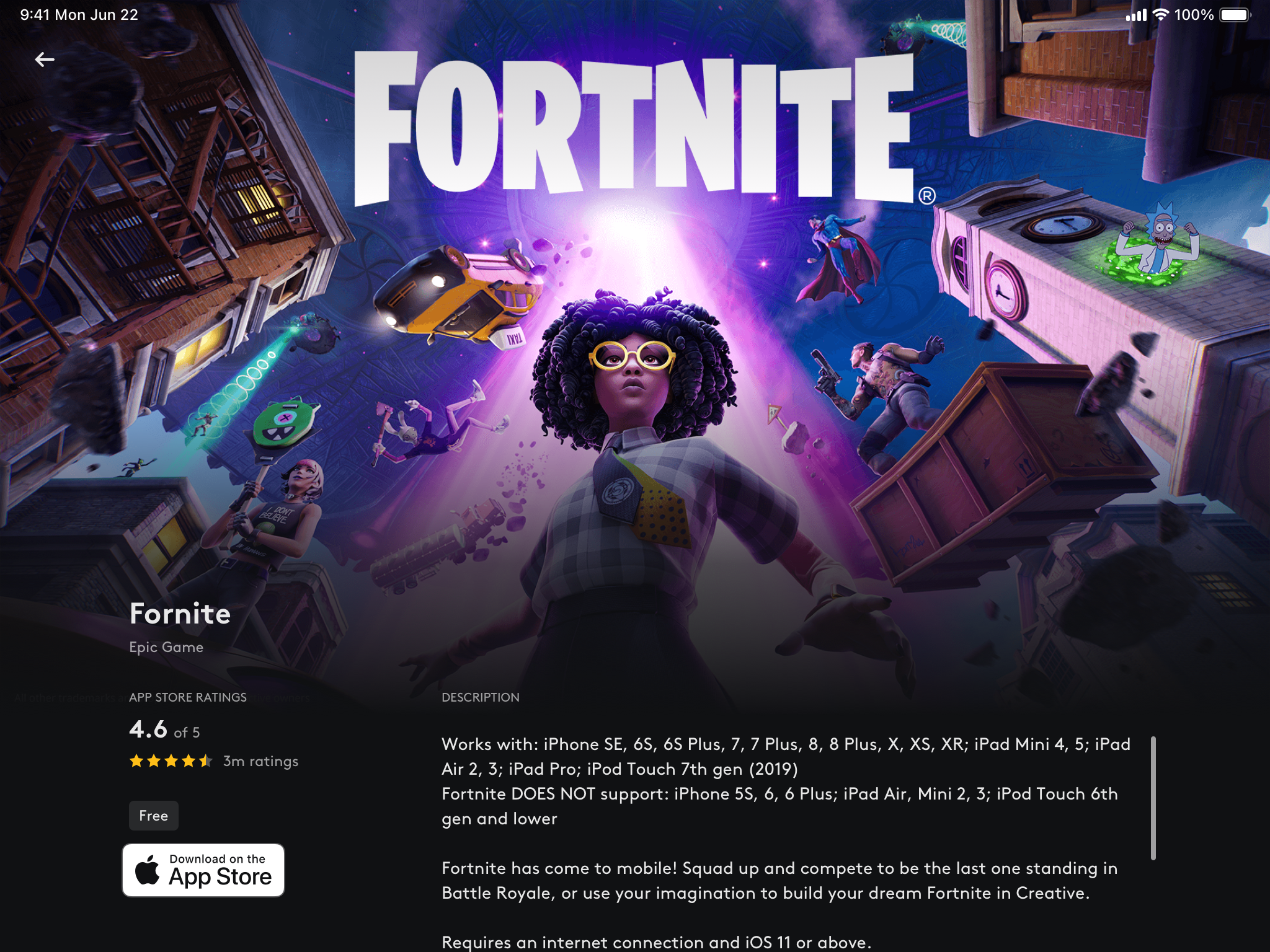
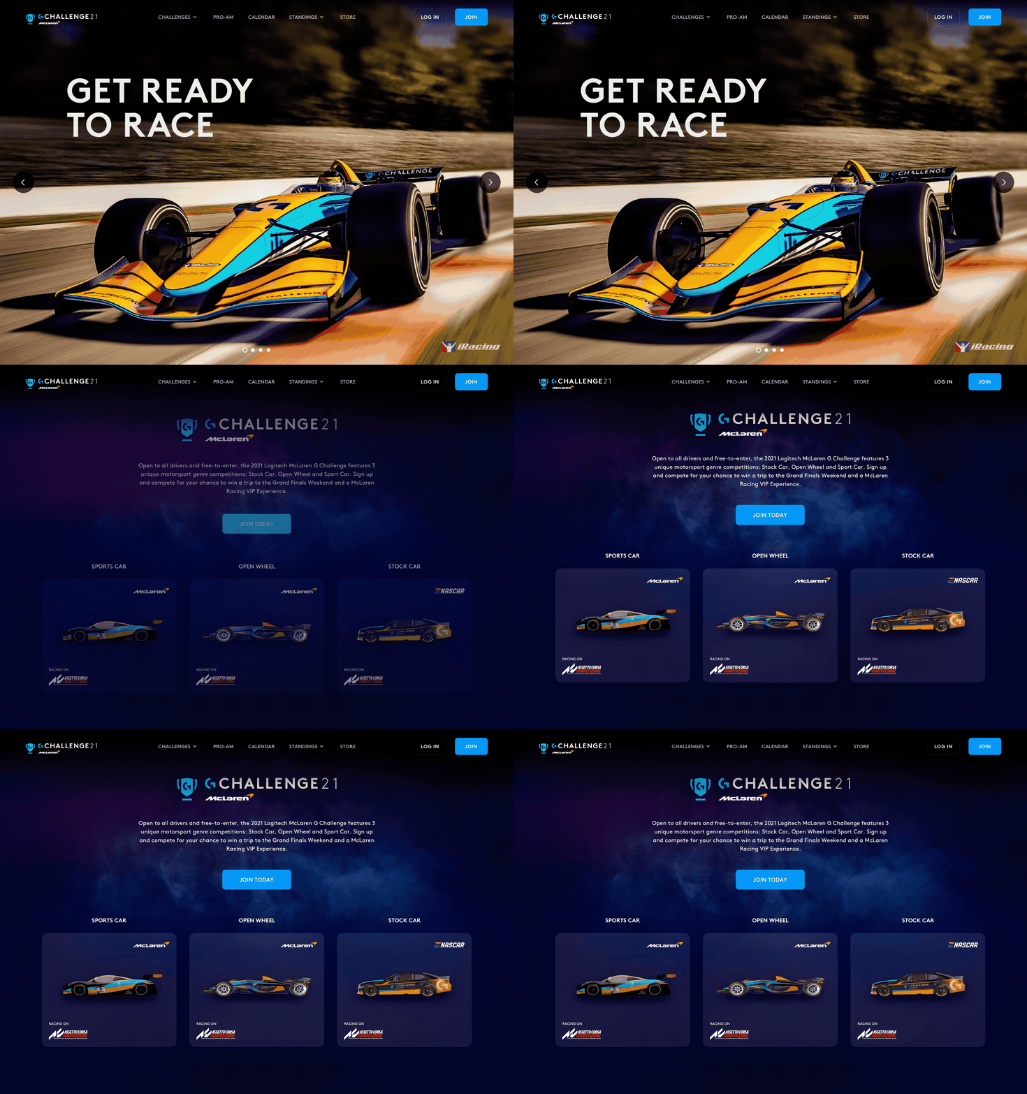
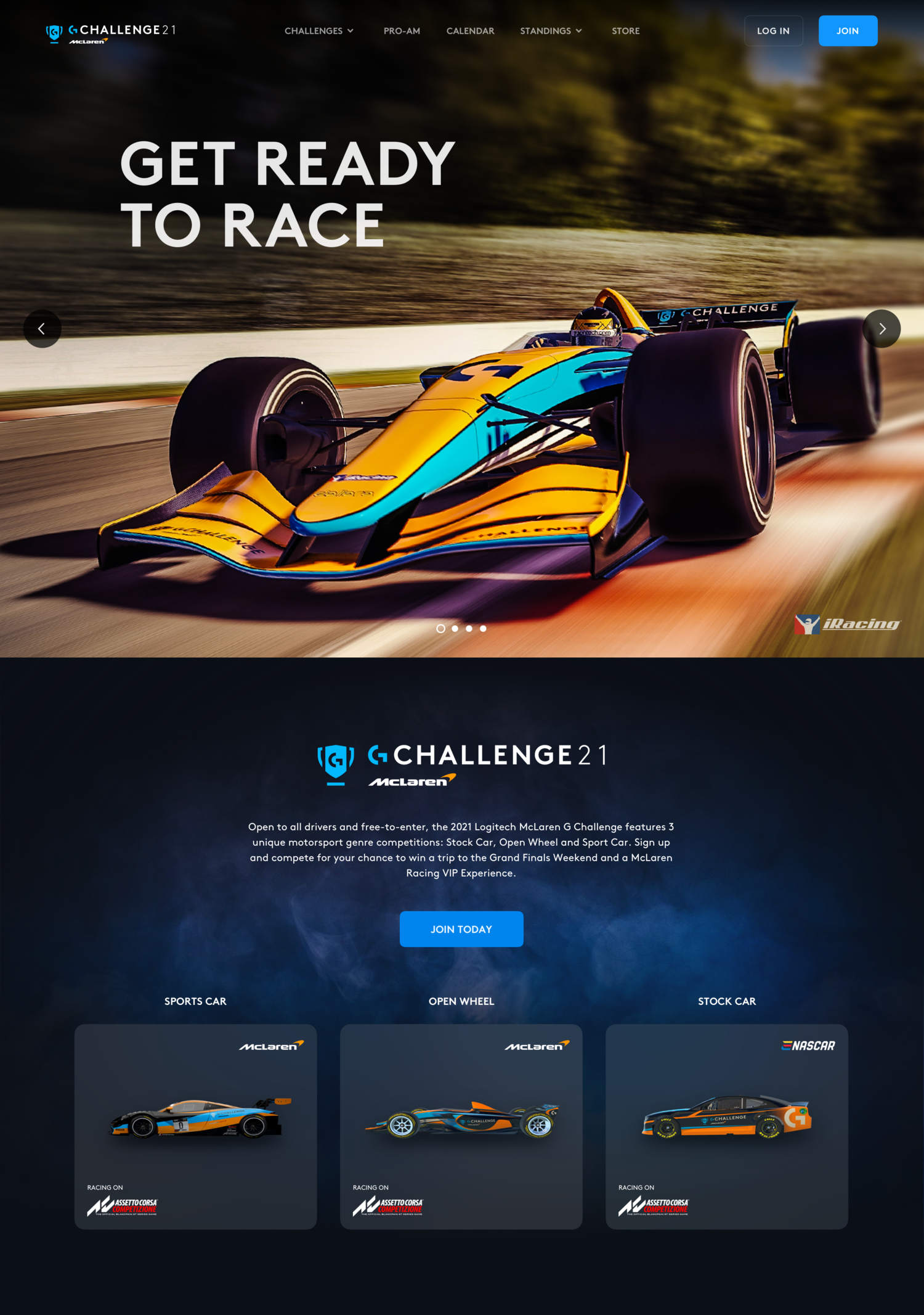
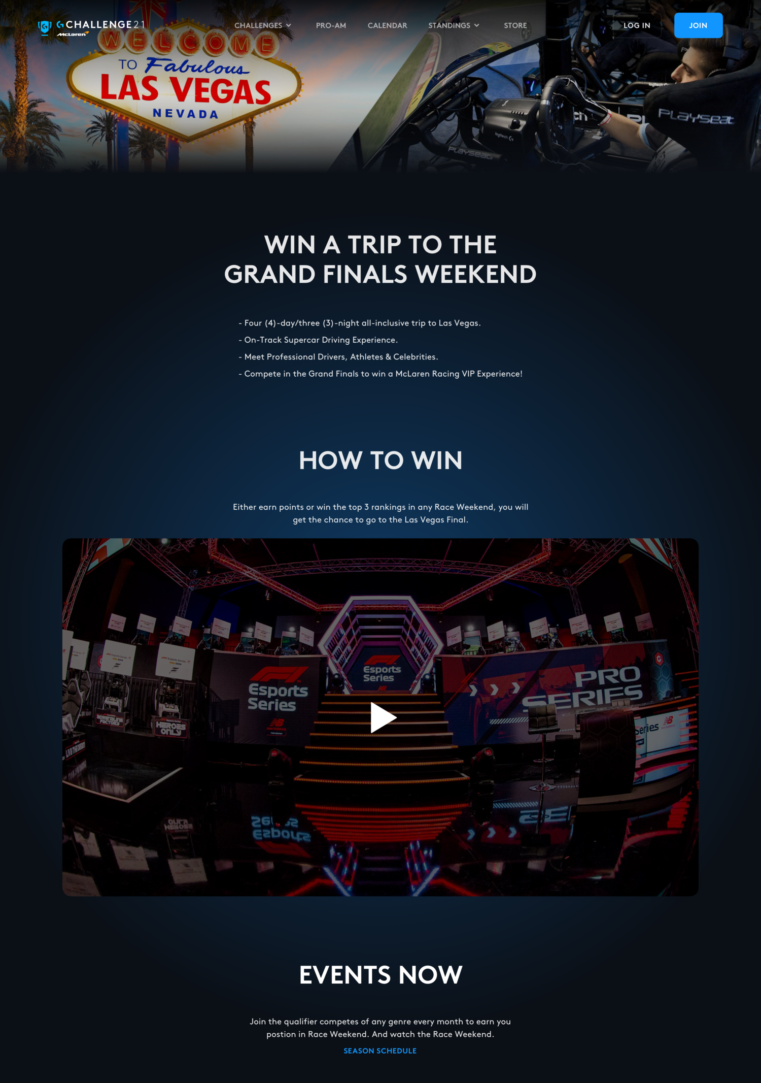
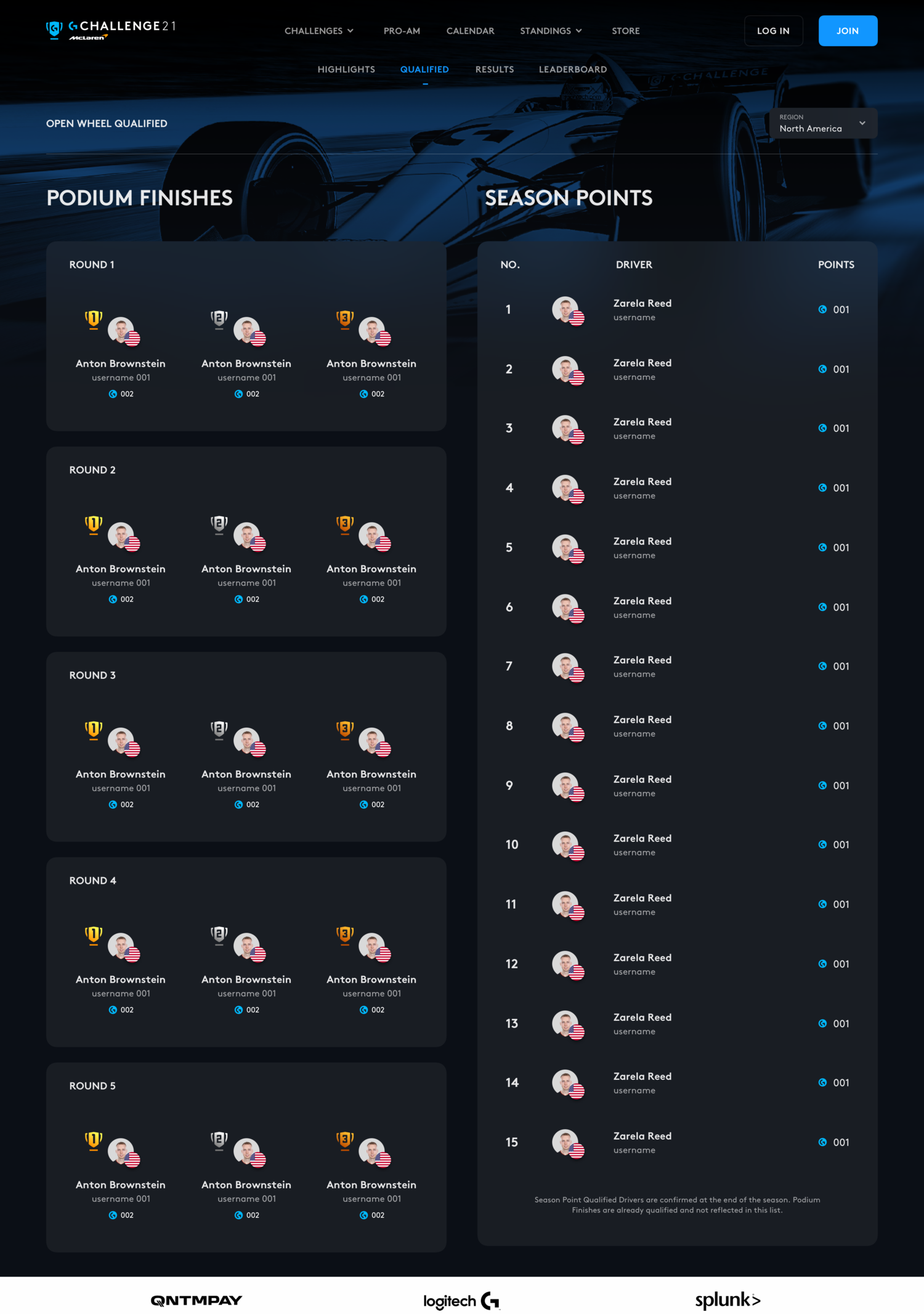
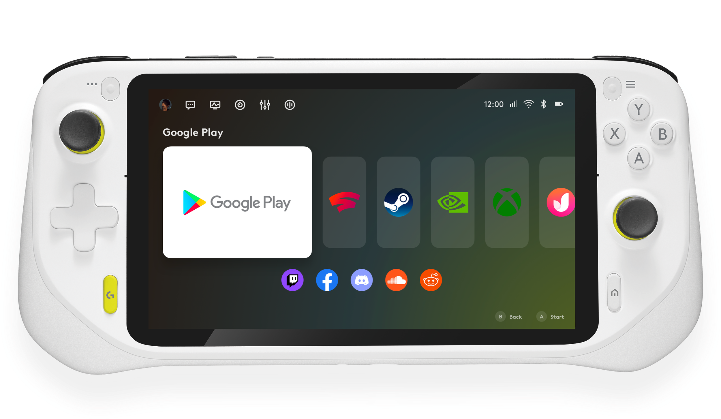
Here are some screenshots from the products that I worked on. I designed them with the DLS. They are G HUB Desktop App (Logitech G device configuration app), Sound Mixing Desktop App for streamers, Game Recommendation iPad App for Logitech G’s iPad game controller, G Challenge Website for the tournament of e-racing, Logitech Handheld Game Console Launcher UI.
G HUB (desktop app) ↓
(Earlier Version)
(Recent Version)
Sound Mixing for streamers (desktop app) ↓
For case study, click HERE.
G HUB Audio Config (desktop and mobile app) ↓
A case study for Surround Sound feature. LINK
Game Recommendation App (iPad App) ↓
G Challenge, the tournament of e-racing (website) ↓
For more details, click HERE.
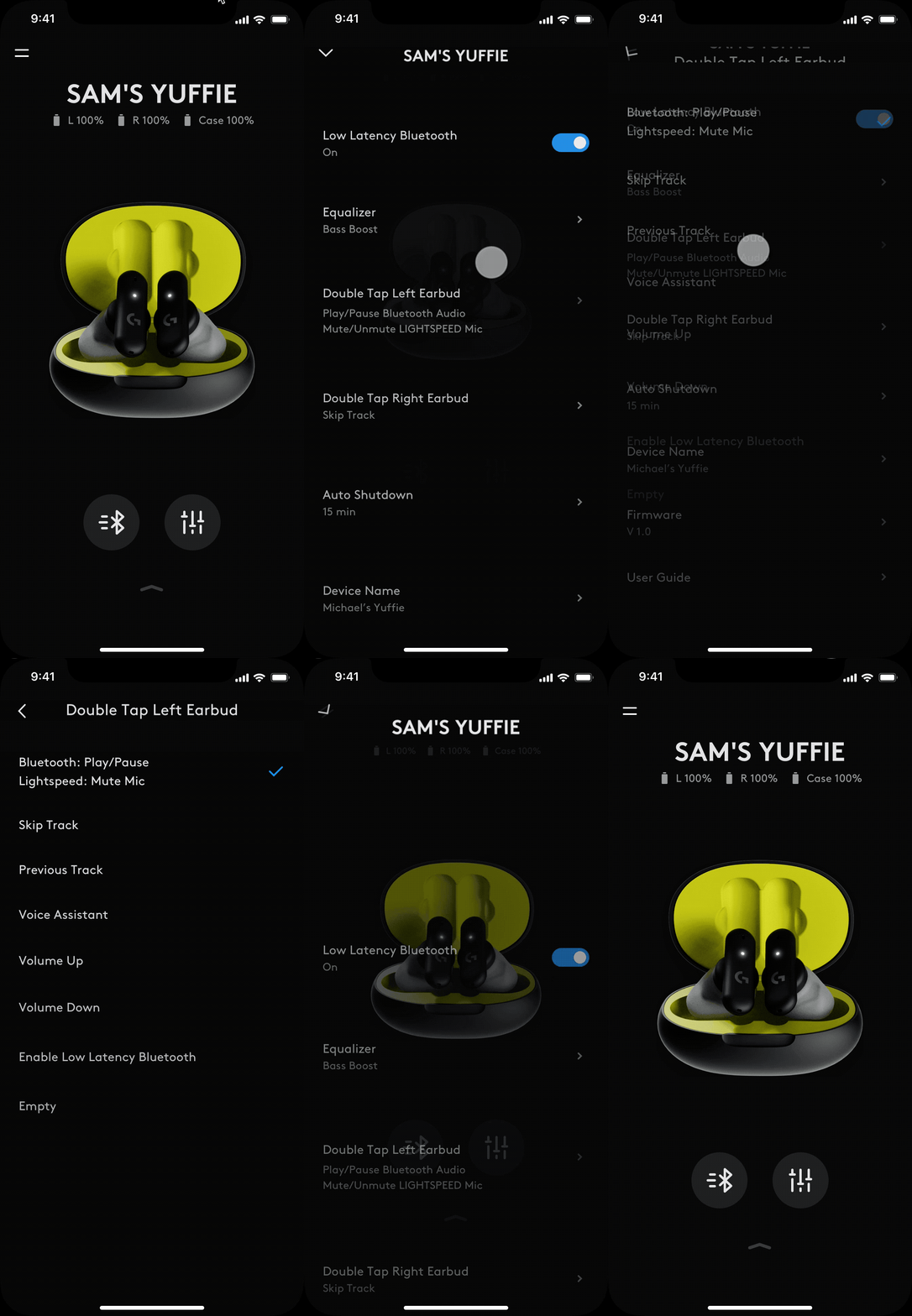
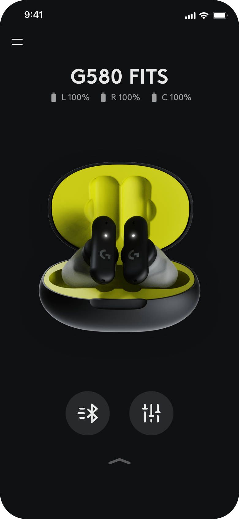
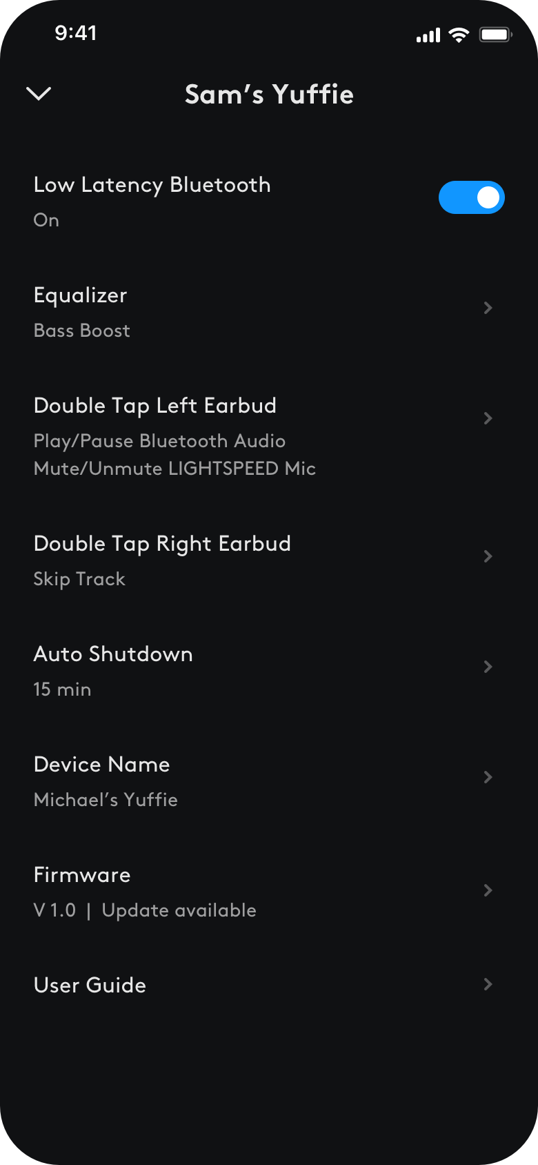
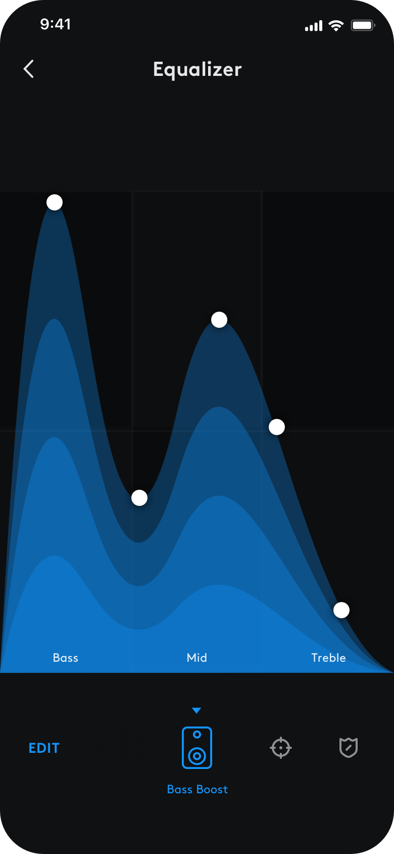
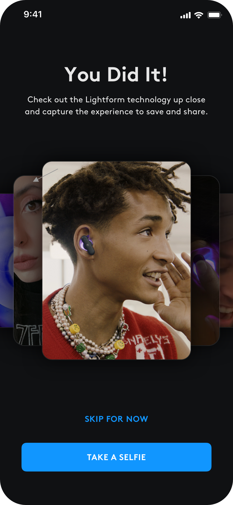
The companion app for the wireless G earbuds ↓
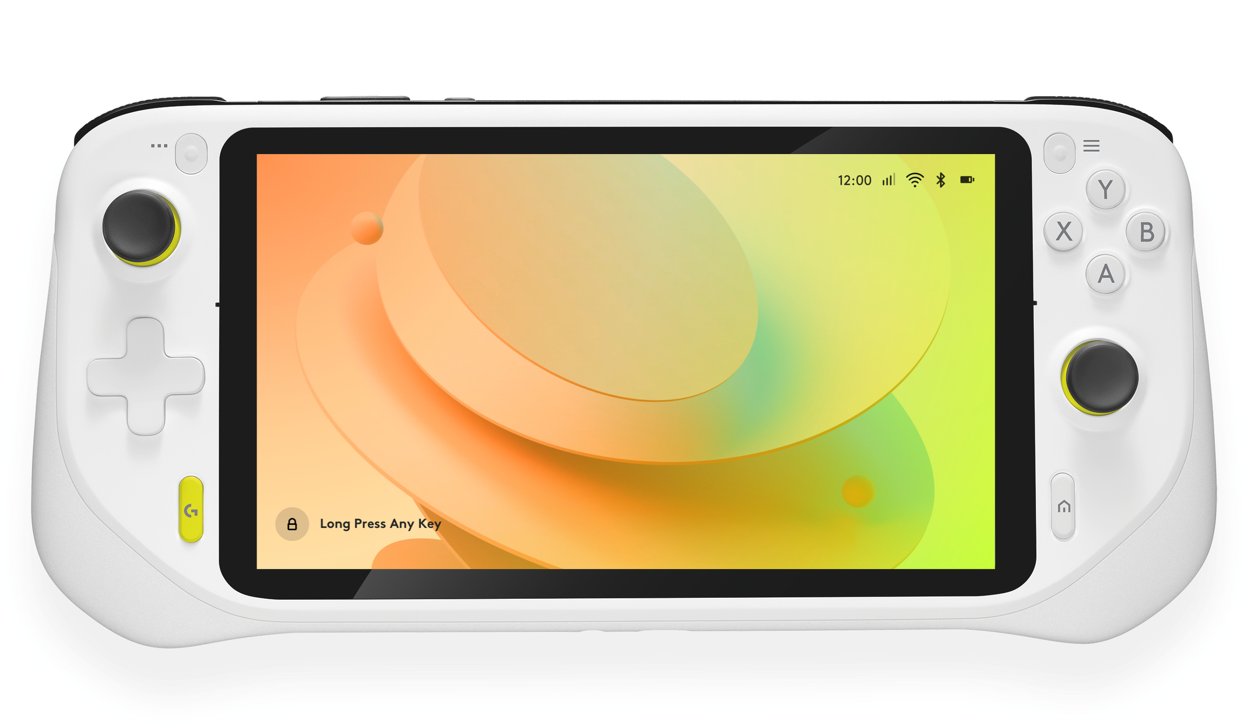
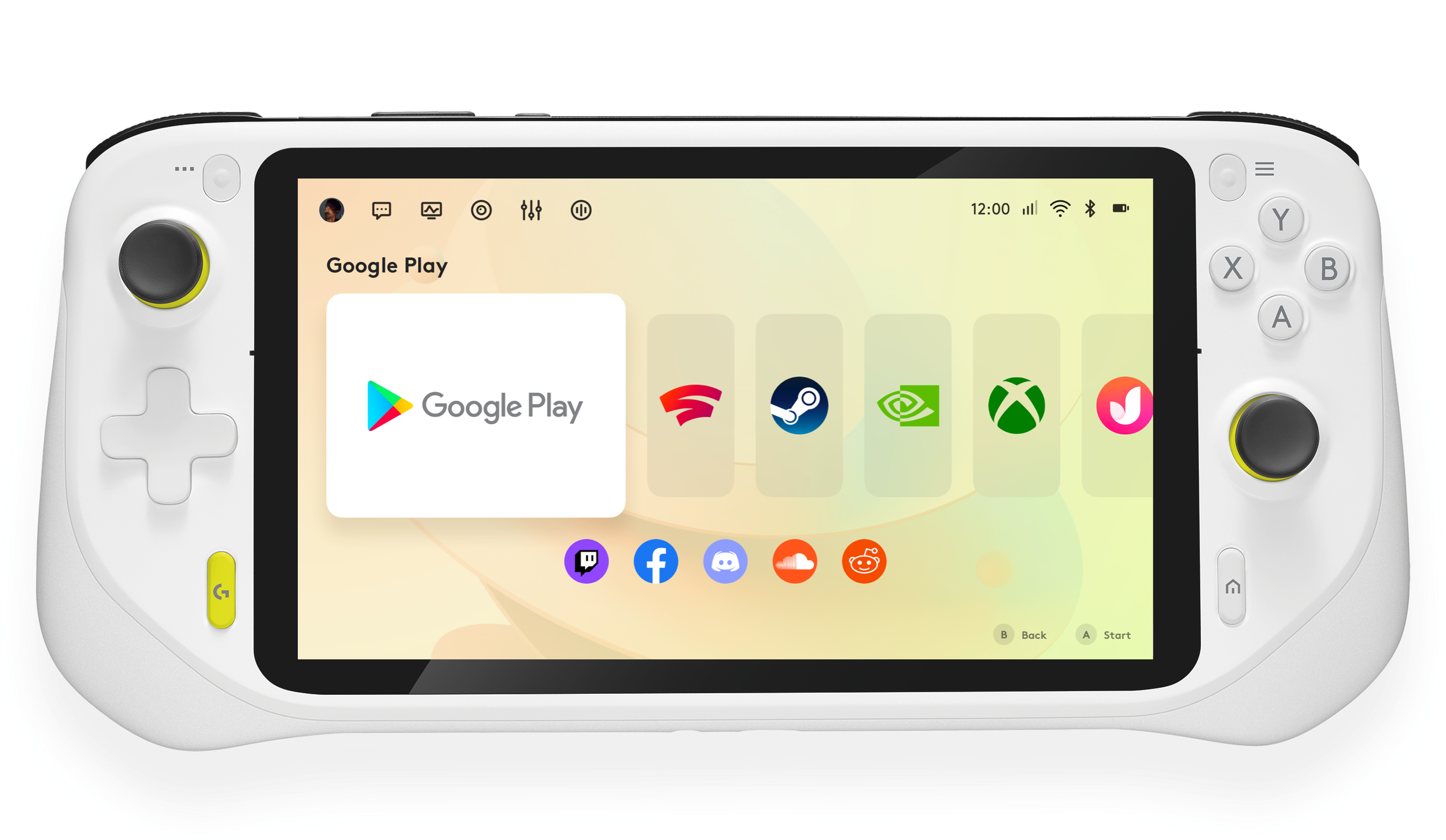
An UI Provocation for a Logitech handheld game console ↓
The Tech
As being a code based design language system, it is designed in Sketch, organized in Abstract, and developed via React.
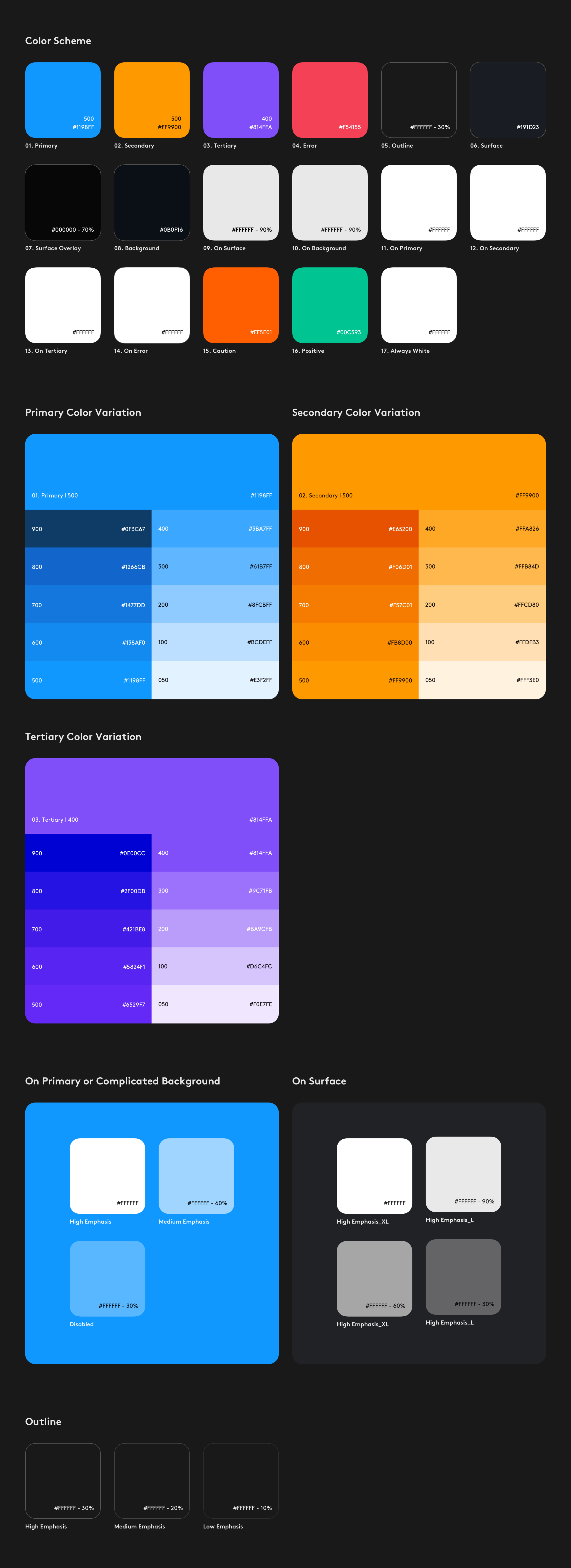
Color
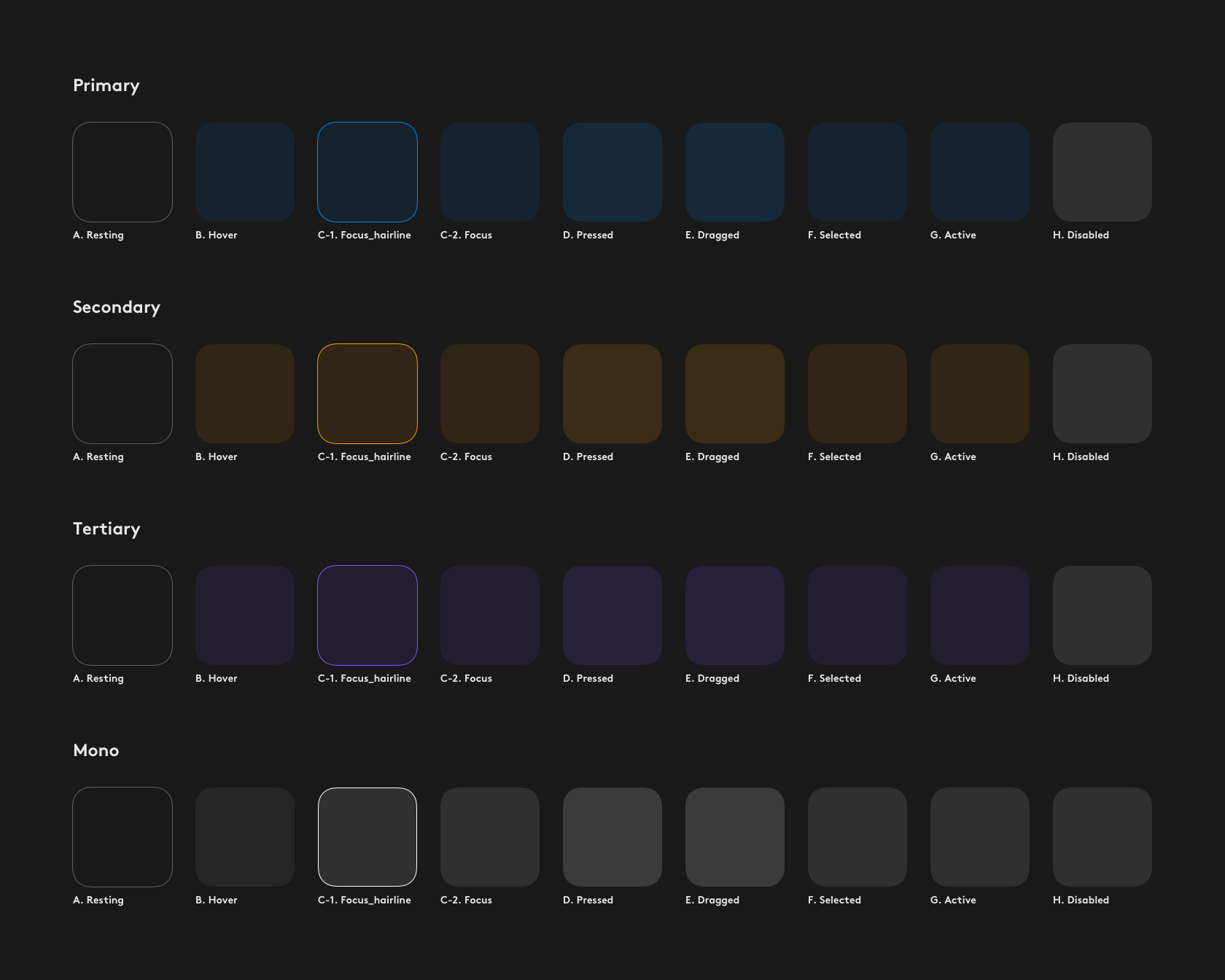
States
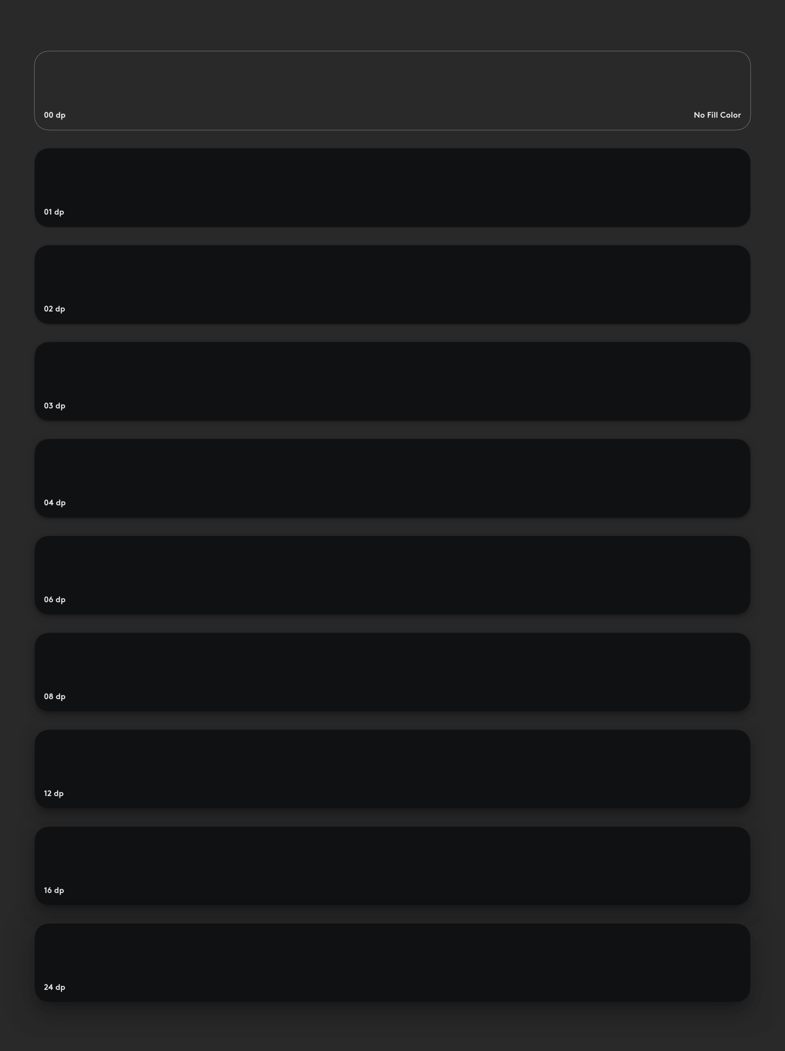
Elevation
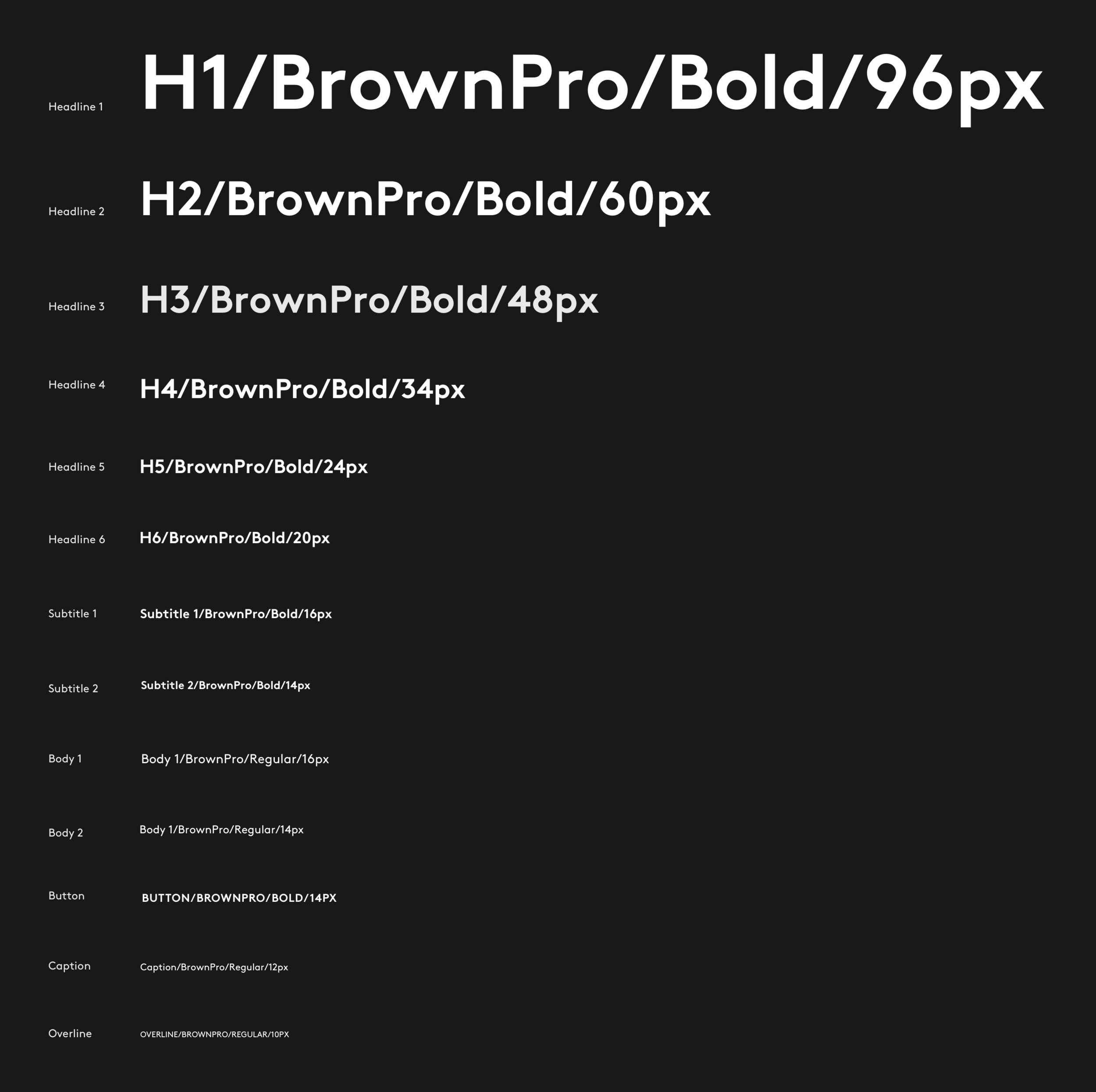
Typography
Grid and Layout Grid
To keep our design crafted and consistent, we have applied grid system.
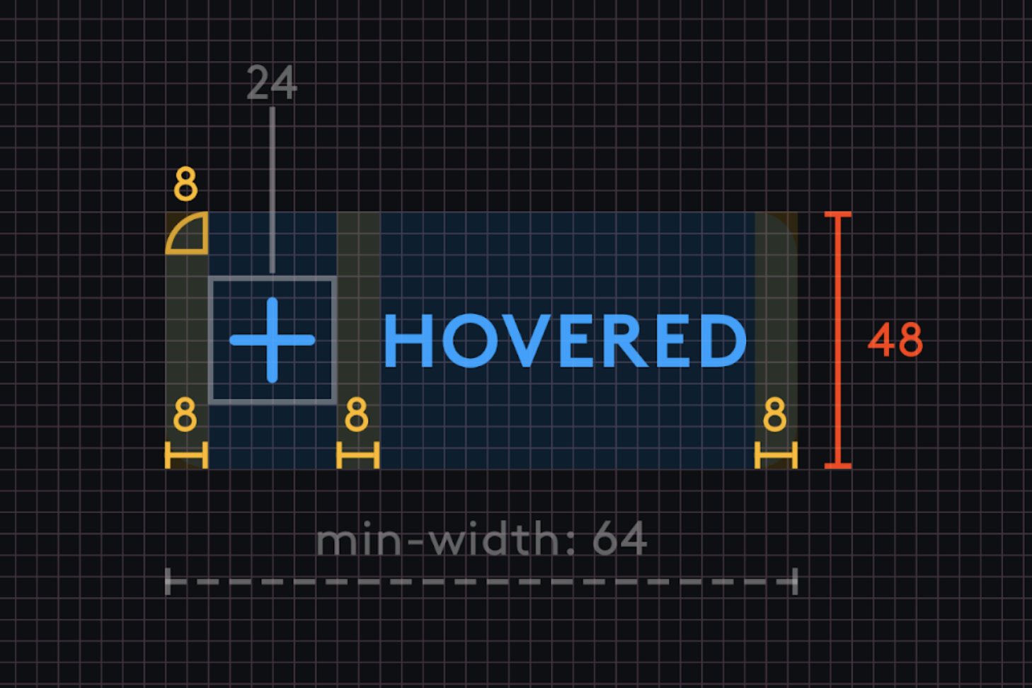
Every component is built using the 4-pixel grid
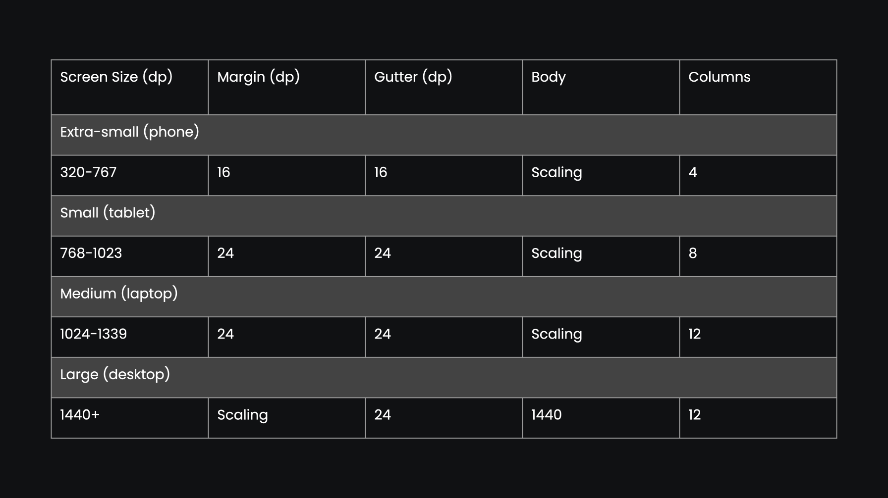
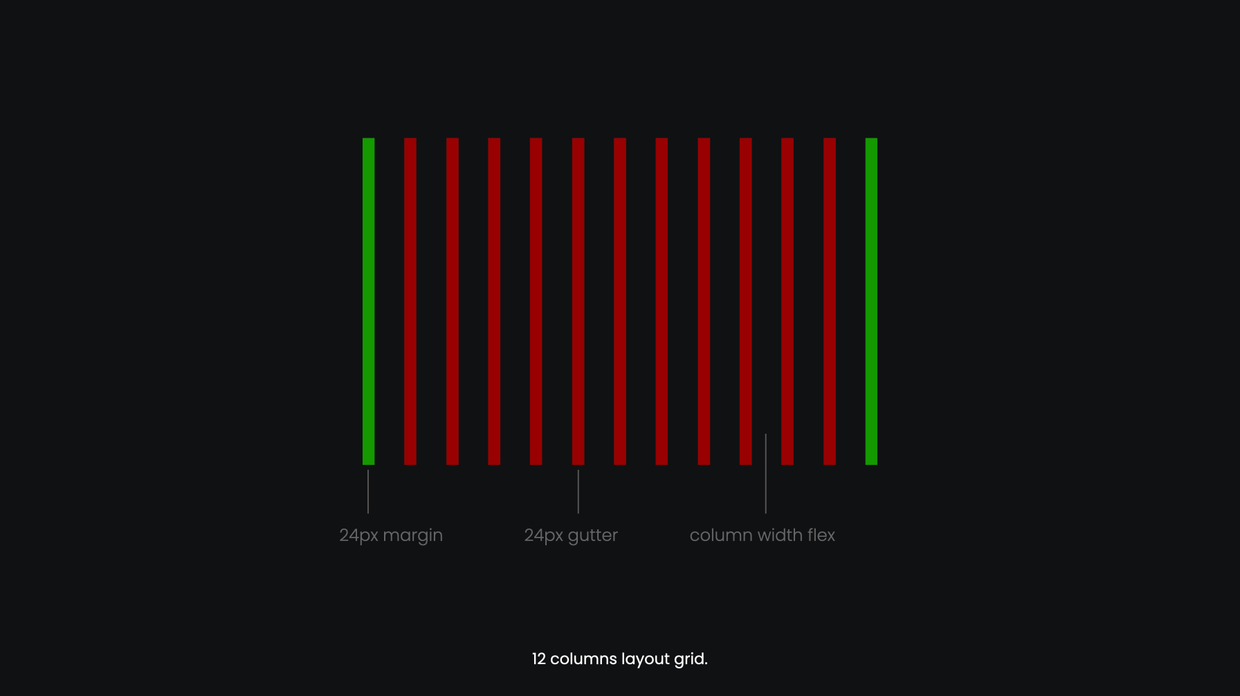
Responsive Layout Grid
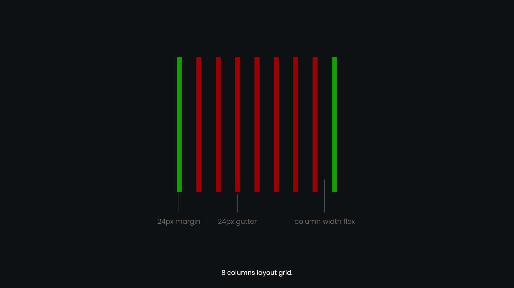
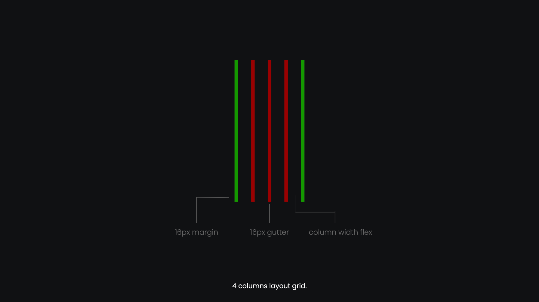
4 breakpoints, and 12, 8, 4 column layout grid.
Ruler System
We set a ruler system to better keep a consistent cadence.
Accessibility
We took WCAG AA as the baseline. And we used a color contrast checker (an desktop app) to help us check the contrast. For the size of the texts, we took Material Design Guideline as a reference.
WCAG 2.0 level AA requires a contrast ratio of at least 4.5:1 for normal text and 3:1 for large text. WCAG 2.1 requires a contrast ratio of at least 3:1 for graphics and user interface components (such as form input borders). Large text is defined as 14 point (typically 18.66px) and bold or larger, or 18 point (typically 24px) or larger.
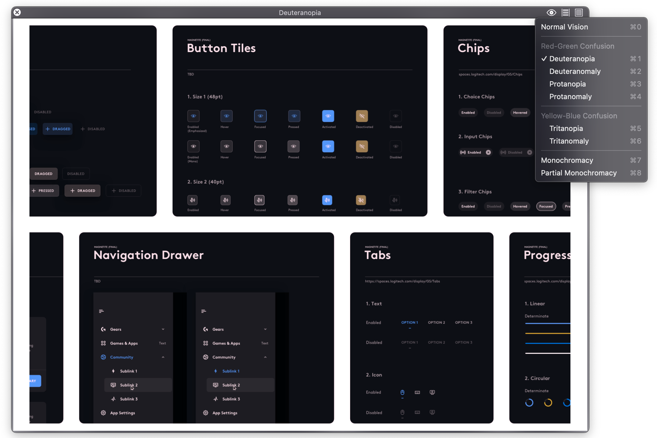
We’ve also used Sim Daltonism (an app for accessibility) to help us empathize the users with vision limitations.
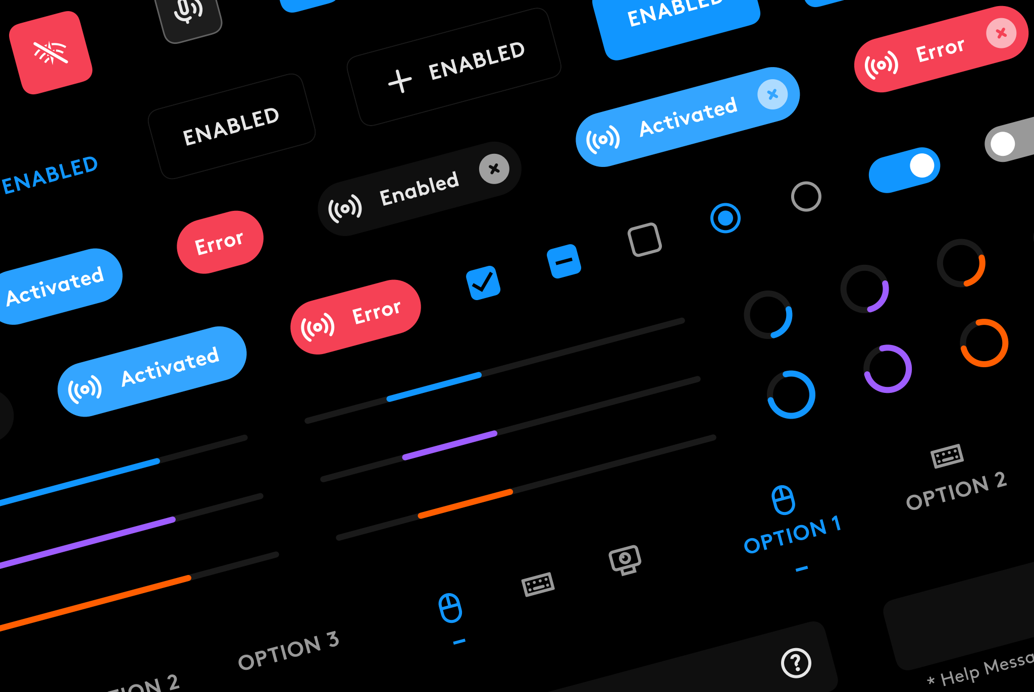
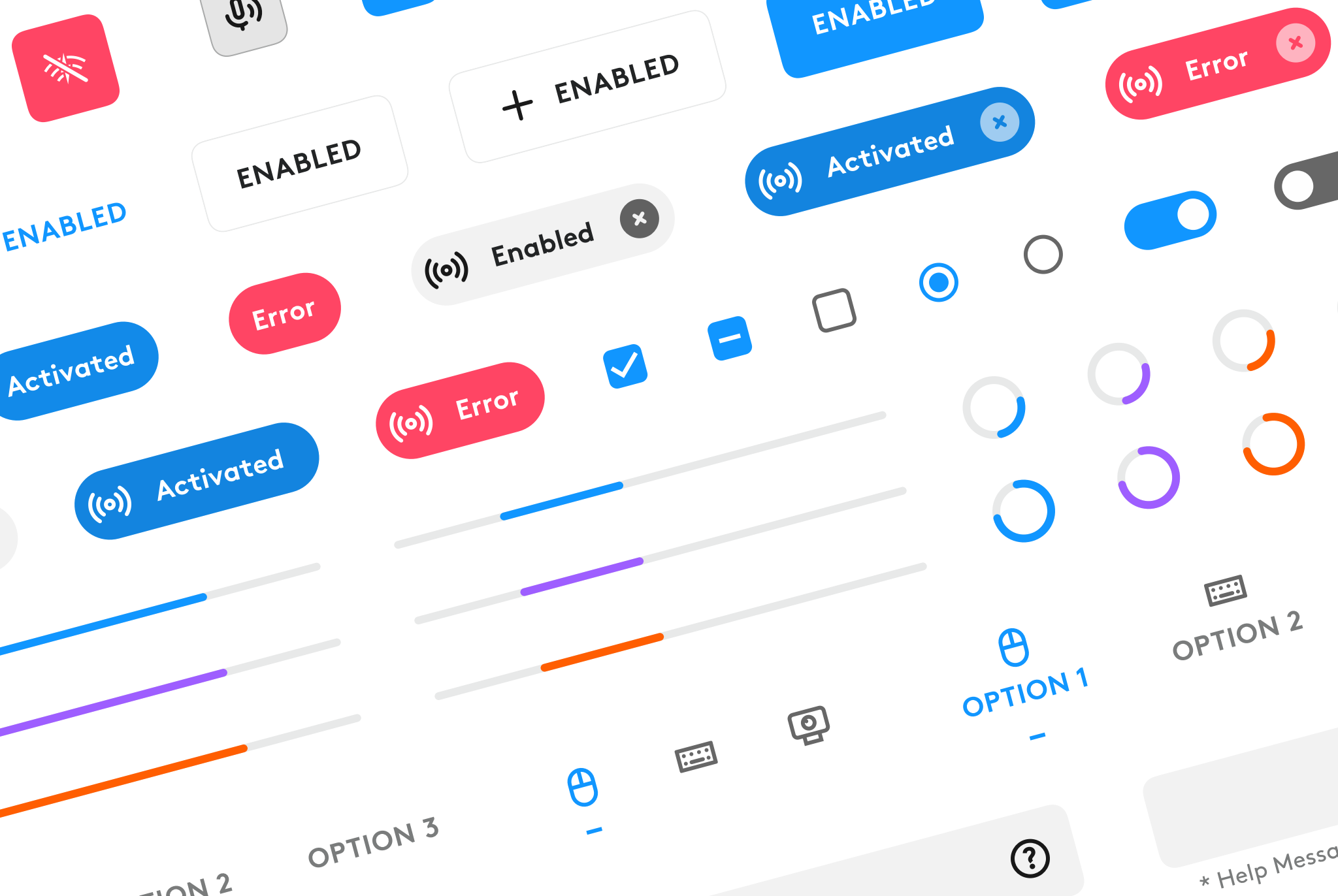
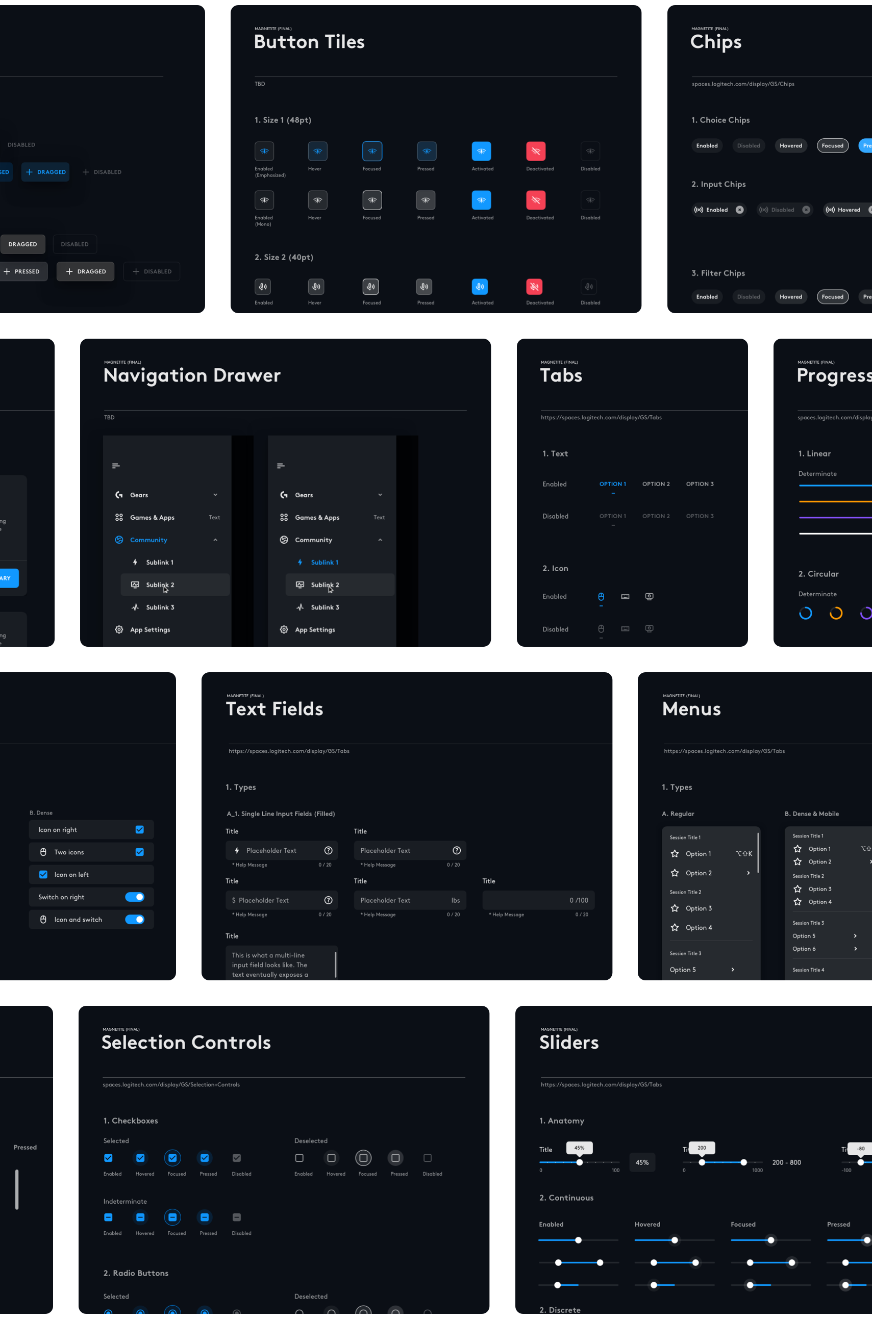
Sticker Sheet
There are 16 sets of components in our library. Banners, Buttons, Chips, Dialogs, FAB (fast action button), Lists, Menus, Progress Indicators, Navigation Drawer, Selection Controls (Checkboxes, Radio Buttons, Switches), Scroll Bar, Sliders, Snackbars, Tabs, Text Fields, Tooltips.
For building the components holistically, we have mapped out all the states for each of them: Enabled, Hovered, Focused, Pressed, Dragged, Selected, Disabled.
Architect
Sticker Sheet
Components Anatomy
Every components were build in a structure that contained States layer, Color Container layer, and Elevation layer.
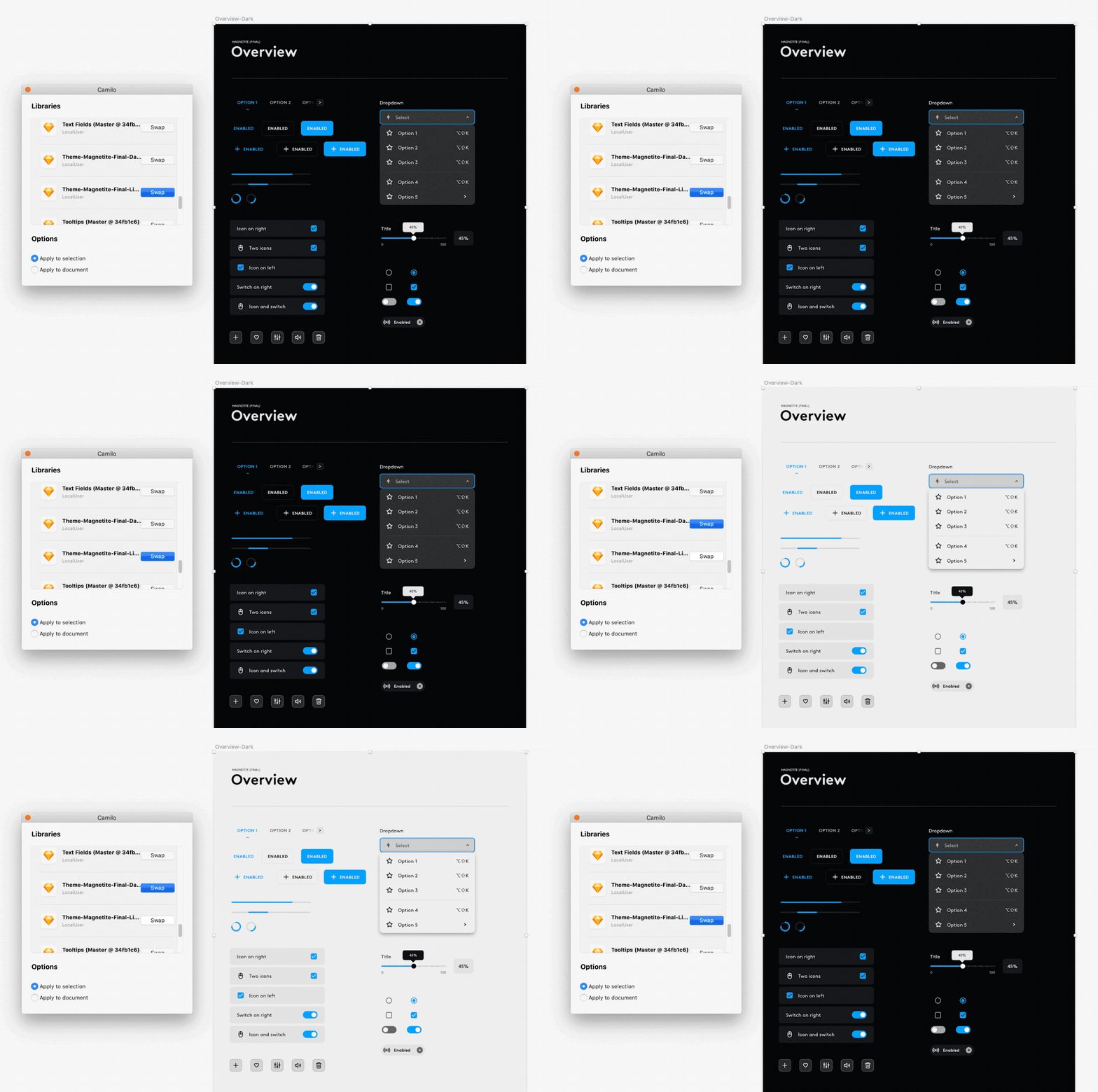
Theme Switch
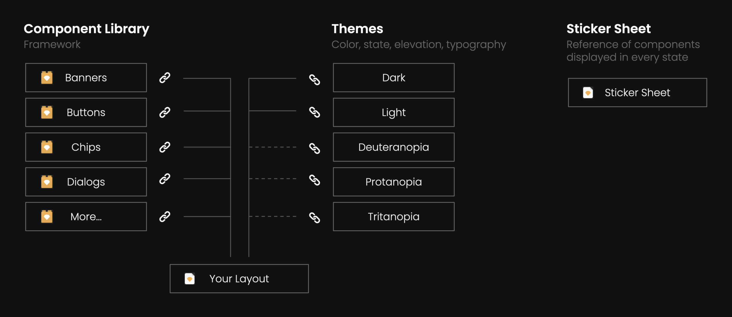
We used Camilo, a Sketch plug-in to switch between themes. As we have properly built the color libraries and linked them to the components, theme switching is just by a click.
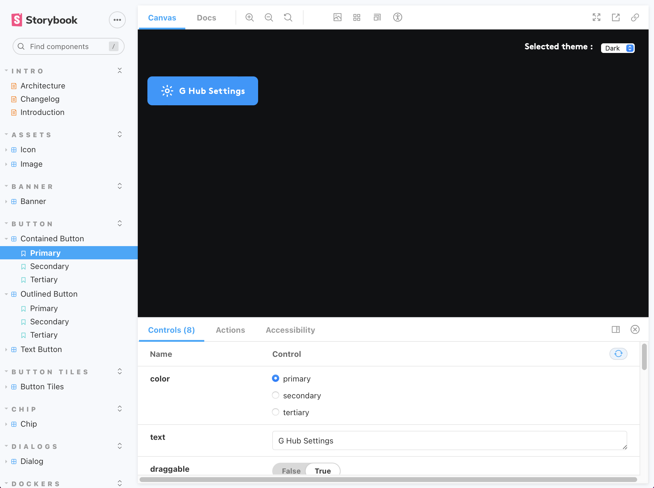
The Code Based Components
Our engineer team has built out the components on Storybook.


