MusicDigs_5_precedents
Precedents: Spotify's Behind The Lyrics. The content plays automatically and it's too hard to go back.
Precedents:
On Apple Music, users may mis-tap the icons on the tab bar when triggering player screen. The player bar is good for Spotify as it doesn't have a tab bar. So I designed a small vinyl on either sides of screen for triggering player screen. As a result I can keep the tab bar and lower the chance of mis-tapping. (I have to keep tab bar, because users can double tap the icons to return to main screens.)
For adjusting time, it's ok to use the traditional way. But it's not intuitive enough. Besides we have to press those small dots.
Precedents:
On Spotify, artists can share the music they want to recommend. But it takes extra effort to make this recommendation. It would be more convenient if artists just "dig" the music they like and others can see them directly. Users can also see the playlists from their followers and the people they are following. However users want to discover more than just the songs and playlists. They also want to discover albums, videos, artists and live venues as well. In addition to the editors' playlists, it's great to see also curators' playlists in Apple music. However can I expand this even further? Can everyone be a curator? There are a lot of good curators who are just regular users.
Precedents:
For discovering them through live venues, we can open live venues’ websites. We can see the performing artists. But we don’t know whether these performances are popular or worth going. whether there are other performances in other live venues are more worth going.
For figuring that out, you can open some websites for events (like Ticket Master). Then you can know which ones are the hottest performances and who are the hottest artists.
But questions come: where are they? Which ones are easier to go?
Besides, location is also another consideration for exploring performance and performing artists. For example, people may be more interested in the performance in Mission district rather than sunset district in SF, more interested in East Village and Williamsburg rather than Upper West Side in NYC.
Considering these pain points and opportunities, I designed a map based user interface to discover the best performances and artists through live venues. For helping users find more best performances, I designed a timeline for checking performances in different days.
The Precedents:
A neat thread list is for reading efficiency. Besides, a neat list is a good base to add necessary features on.

For designing the information in the list, we put the sender’s name on the first line, the content on the second line, and the email topic on the third line.
+ The sender is more important than the topic. For example, when you see 2 emails with the same email topic “Let’s meet tomorrow” from me and your boss, which one is more important to you? That’s why we choose to place the sender’s name on the top.
+ For the email topic, if it contains multiple emails, the topic won’t change that every time we receive a new email under that email topic. That’s why we place it on the bottom. Finally, we have a “who said what at where” structure which is more readable.
How to help users find the information that they want quickly? And how to help users start a conversation easily?
From there, I began to design the experience. I believe that separating the interface into clear areas by user goals will be helpful for users to access their goals (finding the information that they want; starting a conversation).

What should I do if I just want to copy his/her email address? That's why I decide to give a hint on the address itself.

How to save more space for the next email item so as to let users know that they can check their email accounts individually? How to prevent users from being tired of the plain layout?
Based on the 2 challenges above, I began to design the experience.

Let me take the card for flight ticket as the example to show my design process.
1. Selected information for narrating a card.
The information contained by an avatar is richer than an icon. It shows “A xxx from xxx”, which can clearly narrate the card.
The flight icon expresses a flight ticket, while the avatar expresses a flight ticket from a specific company. If there are 2 flight cards are laying together, users still have a chance to recognize them. That's why I choose avatars as the main narrators.

Comparing with Google's.

How to describe the journey?

2. Designing the card based on users goals (scenarios).
I defined 2 typical scenarios that users check the flight ticket card:
+ Scenario_1: For adjusting reservations. Do you remember the conversations that you have with the customer service for reschedule your flight ticket? That's why that the informations are in that order. Knowing the confirmation number and the phone number of the airline company is the first step to access their goals.

+ Scenario_2: For checking flight information. Help users focus on the core information by visual hierarchy. (Date, Time, Flight Number)
Flight numbers are the keys to check more flight information. Such as updated schedules, terminals. That’s why they are the most emphasized.

Compare with the original email.

For our first version, we are more driving this email product to a chatting product. So we don’t provide options for “Reply” and “Forward”.
Let me demonstrate the process from the very beginning.
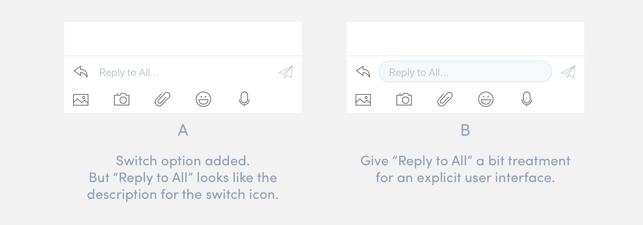
As you can see from the picture below, our first version is pretty similar with FB Messenger. The reply area seems that it does not belong to the 20/80 principle. We had some discuss whether we should show all the options or only the most frequently used options. But for efficiently sending messages (pictures, voice, emojis), we decided to show them all for now. We will collect the data for user behaviors. Then we will improve the design from there.

A clearer user interface that helps users switch to "Reply" and "Forward".

1. Help users to check the email relevancy easily. (To and Cc are different for email context.)

2. Selected information and better readability.
Following the traditional layout for the email details makes the information a bit redundant and scattered.

As users coming to this screen are either from the bubble lists or the thread lists, the users have already known the senders’ names and the times. That’s why I hide the senders’ names and the times at the first view. However, users still have the chances to see them after tapping on the “Details” buttons. And I also redesign the layout which allows users to read the details more fluently.

1. The bubbles are neater than the original emails.
We find emails often contain quotes (which are from the past emails) and signatures. They are distracting when users read the core email contents.

That’s why that we hide quotes and signatures in the bubble view. That can help users focus on the core contents.
2. The bubble is with better readability and contains consistent tapping area which is the access to the email details screen.
In our real case, most of the users don't have avatars. So we have to set default avatar based on their initial letters. In that condition, we have to show names for them, or the users won't be able to recognize who sent these emails. Comparing the senders' name, time is less important. That's why I place time at a less noticeable area.
Our first proposal is based on iOS Messages and FB Messenger. But for our case, the readability is affected. Because users usually have to check the senders' names, as the senders usually just have the default avatars.

How do I improve the readability for the bubbles.
For 1 on 1 conversation, the 1st version is fine. But it doesn't work well for group conversations.

The final version also provides a consistent and big enough space to tap for checking email details screen.

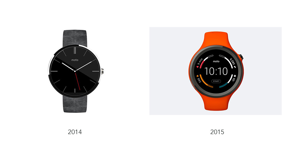
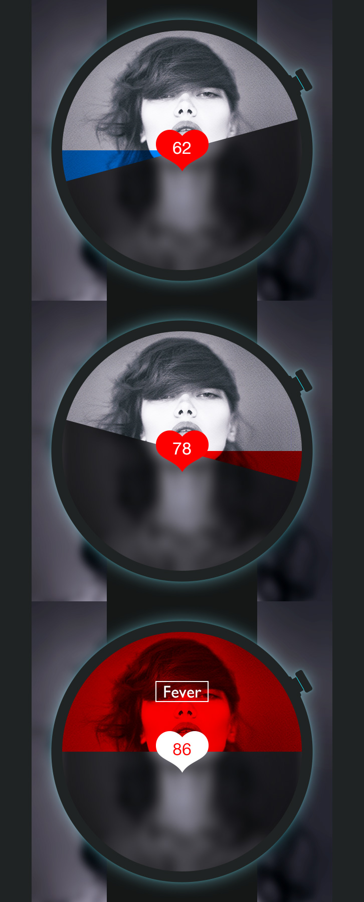
And I also showed my smart watch concept in NYC Media Lab Summit 2014, Behance, Dribbble, introduced to some Googlers, and listed in ADAA 2015 semifinalist. I guess my effect is not strong enough to effect these two major brands. But they are good examples to show my concept is practical as well.
My design,

Moto 360,

My design,

Moto 360,
Samsung Gear S2,


It's a presentation for introducing what we are going to create for our thesis in the following year. Check the presentation here,
It triggers sound by light!
This "violin" makes sound by light! It is a really impressive piece from my classmate, Brendon. Awesome!
After reading the articles and books about the history of mobile and wearable, I have some proposals for designing near future wearable products. The short paper are divided into 3 parts: Sharing Common Platforms; Seamless Cooperating; Combining with Environment.
The paper is here,
I do research in smart textile and its application for sportswear.
The e-textile can give preciser body surveillance and better following services than currently popular wearables (such as Jawbone). Jawbone-like wearables can't get precise data. Although Amp Strip can, we have to stick them on our body. When it comes down to e-textile, getting data from our body becomes preciser and more natural. Such as data from our hearts, breaths, even muscles. But small boxes have to be stuck to the apparel. If we cross printed circuit to the clothing, there would be no redundancy on our sportswear. Using e-textile, we can even change the experience of workouts. The workouts could become games. Because of e-textile, wearable technologies can be hidden. It can help us know ourselves better and even change the whole experience of workouts.
Final paper is here,
The Design Process we are learning.
Based on the design methodology, we are making paper prototype.In the first class, we brain storm what we want to design individually.
In the second class, we are assigned into groups and use Affinity Map to find out our group idea. So we can decide what we are going to design.
Draw some sketch for wireframes.
Draw wireframes in computer. Then print and cut for user tests.
It is for evaluating a website, finding the pain points and trying to give suggestions.