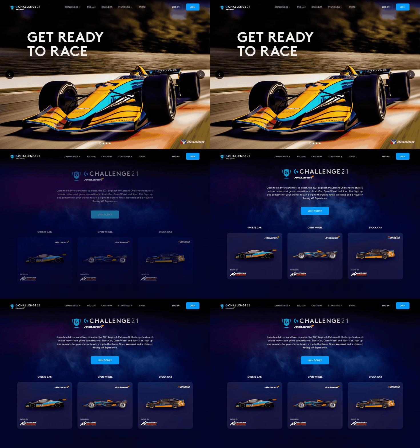
- Intro -
A visual language reset project for Logitech G’s e-racing championship website.
Role
Lead Visual UX Designer.
Vision
Sim game lovers’ leading platform that champions their passion of sim racing and connects them to other players with the community.
Challenges
How Might We refresh the website with the updated Design Language System and elevate the excitement.
Goal
An inclusive, exciting, and consistent visual language that helps the team to keep building the platform.
UX Principles
Let everyone play
Respect and empathize all players to enable everyone to play and play at their best.
Grow with users
Designs should be well considered from players to viewer, from beginners to pros.
Curate for all
Communicate to all levels of users with clear and understandable language.
Connect sim lovers
A mission to connect our users to the community and celebrate for their passions.
Maintain excitement
Strive to instill the energy & passion of sim gaming.
Be bold
Always push the boundaries by being courageous and aspirational.
- Concept -
Challenges
(This is a screenshot of the old version of G Challenge website.)
Applied with the old UI components.
Lacks the excitement from sim racing.
Brand Framework
Referencing our brand playbook and chatting with our brand strategist, I had a good understanding of our sim product line’s (simulation products. such as driving wheels.) brand vibe. It feels solid, focused, and steady. It is coming from the Pro Series line, but it should be more vibrant. And I also understood that the brand was evolving the brand identity. They were considering adding more vibrancy for the brand of the sim product line.
Design with the Latest DLS
The website was designed with the previous version of our DLS. It had been reset to better stand for our identity and vision. So this new version is the design language system that I should apply when refreshing the website.
Final Proposal
I came up with 3 directions to see how far we wanted to go. And eventually we landed on this final proposal, Blue Eye Panther. I wanted to catch the exciting moment that was right before starting to race.
Here are the other two directions that I came up with. Usually, when designing for the new visual language, I come up with multiple directions to sense the team’s appetite and touch the boundary. It is not for the team to choose one and continue. It is more for starting the conversation to understand the expectations and the possibilities better. Here are the other 2 concepts. Race with the Wind and Drive to the Future.


