Food Ordering Experience
This is a service design practice. I joined IDEO U’s service design online training program in 2021.
Assumption
Pre
Ordering the food online or through a phone call should be fine. I can check the dishes on Yelp.
During
No parking spot in front of the restaurant. It's hard to find a parking space nearby.
As it is a busy restaurant, I have to wait for paying as I ordered through a phone call.
The food should be ready. I can pick them up after I pay for them.
Post
Pick up the food and walk out of the restaurant with no issues.
Empathize and Synthesize
Observation
After wrote down my assumption, I went through the whole existing service experience in person for empathizing the users and discovering insights.
Parking space.
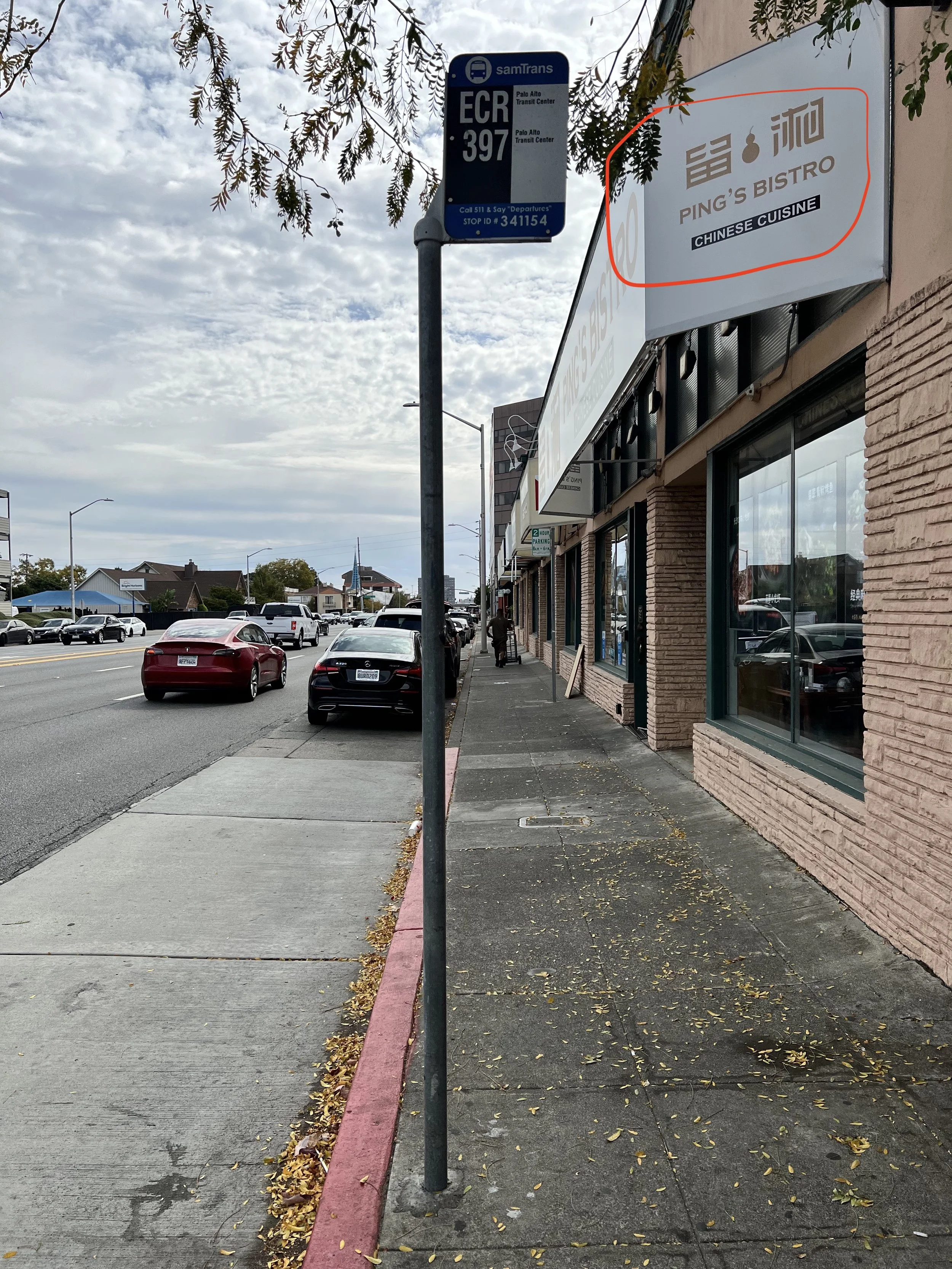
+ No dedicated parking space in front of the restaurant. (Ping’s Bistro is the restaurant).
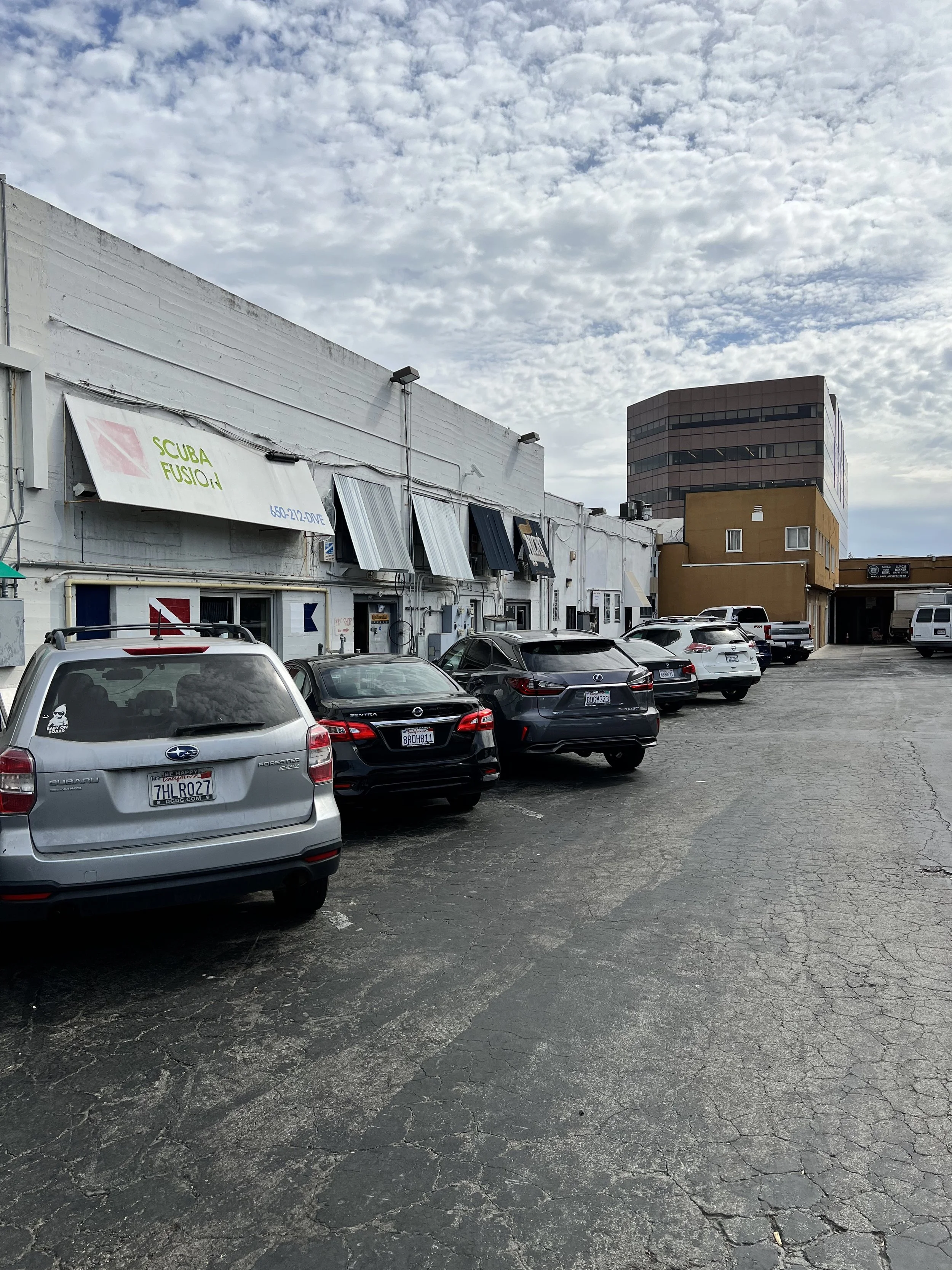
+ There was a shared parking lot in the back of the restaurant which was very hidden. I didn’t find it when I first came here. But I discovered it the 2nd time I came.
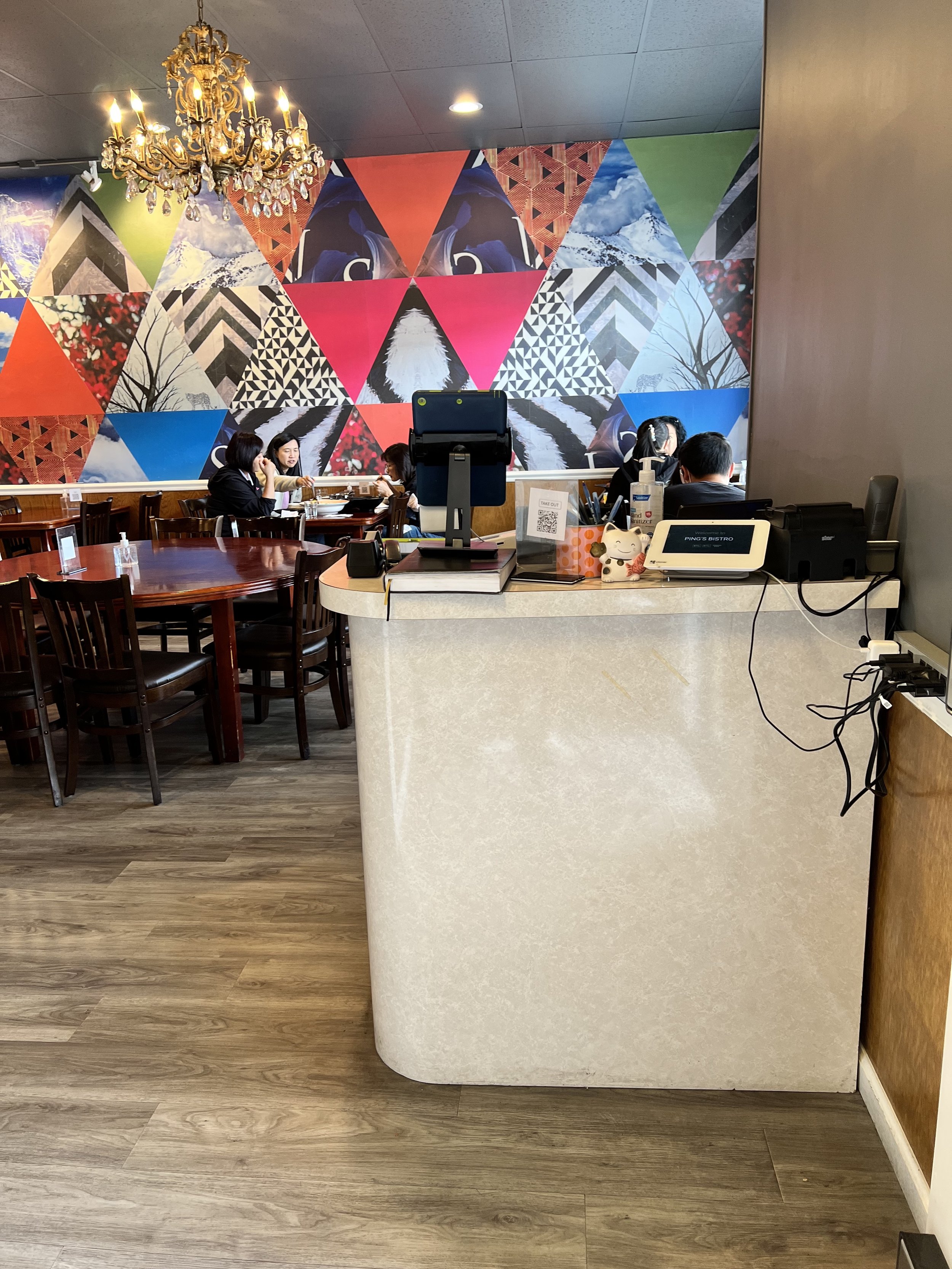
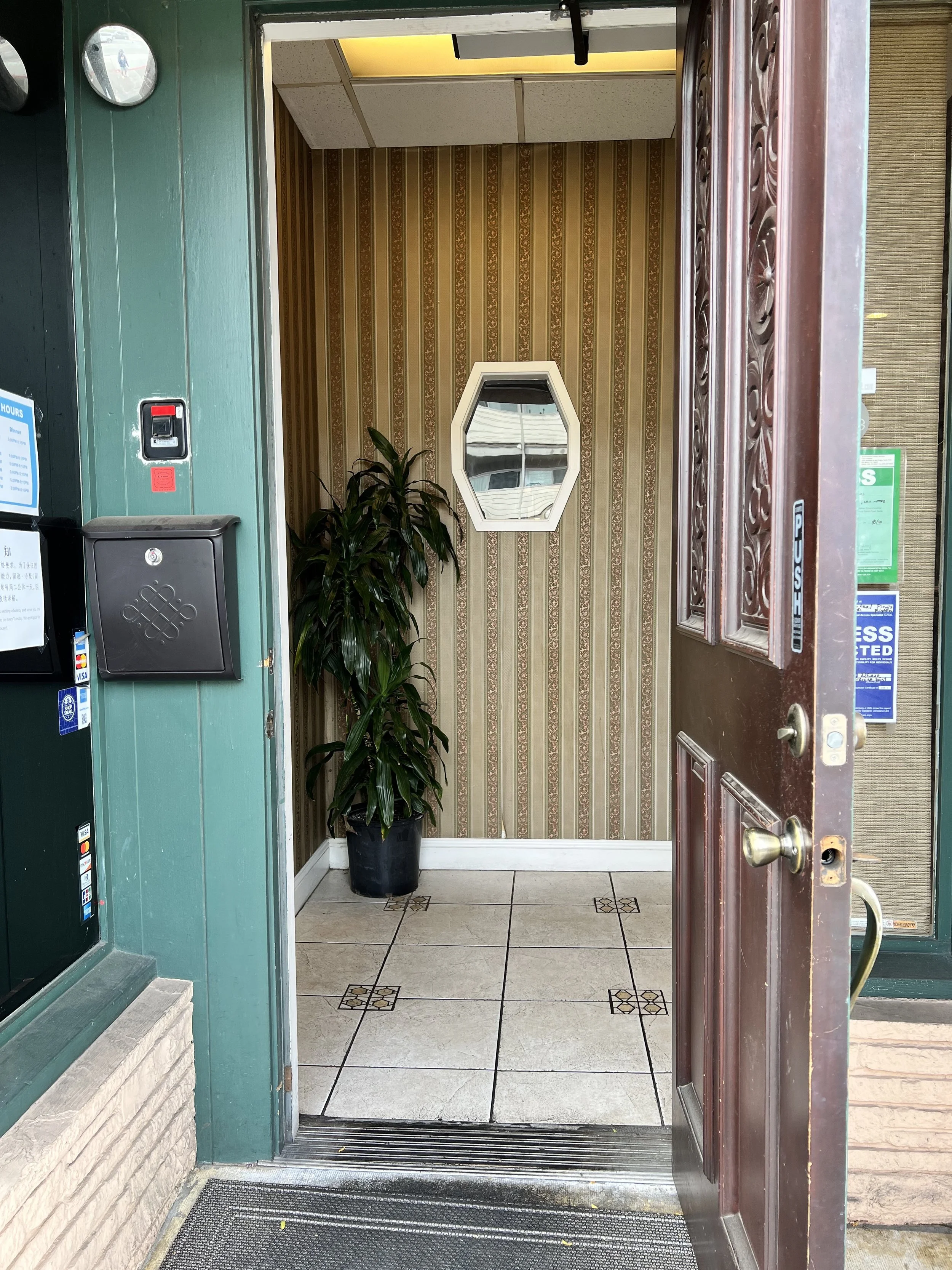
Cashier at the entrance.
+ Convenient.
+ Comfortable for both dine-in and pick-up customers.
Payment kiosk.
+ Support digital pay (Apple Pay, etc.).
+ Contactless
Food shelf
+ A dedicated shelf for storing the packed food. It was on the left side of the cashier desk. (I couldn’t have captured it in this photo.)
Flyouts
+ Flyouts were one the cashier desk. Free to grab. Dishes’ names, photos, and phone number were on it.
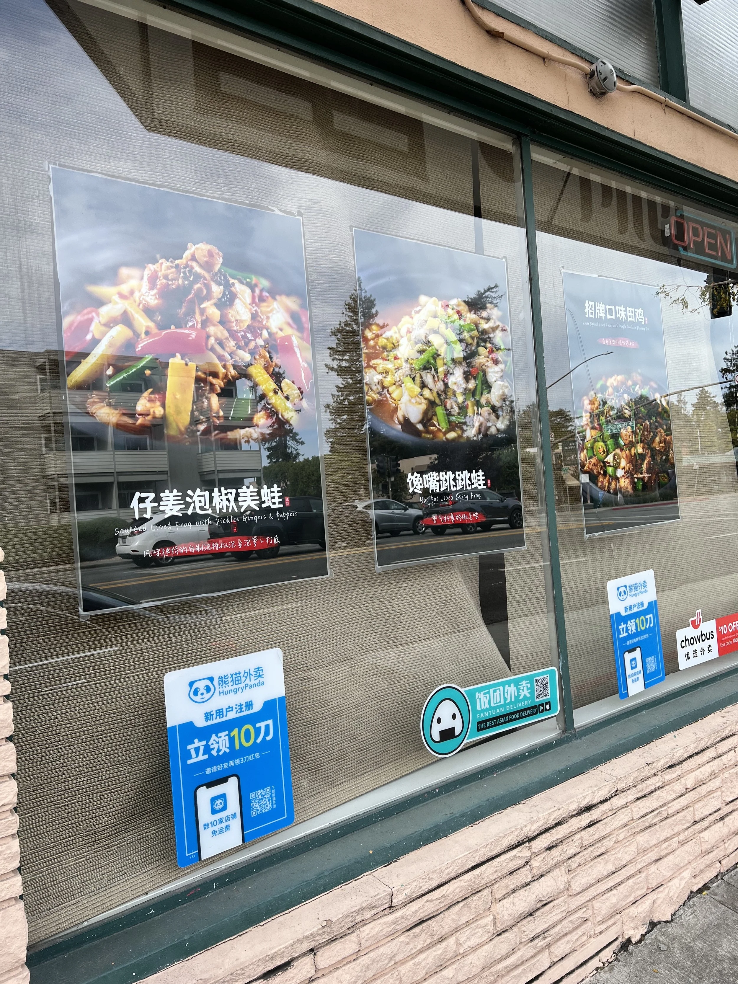
+ Chef’s recommendation posters were on the window with QR codes to order online.
Waiting area
+ Waiting area was very small. It was at the entrance area. But customers could wait outside.
Evaluation
Good
Decent web experience for browsing and ordering food.
No need to register for the website, which is great.
Text messages to confirm and show the next steps.
Well-packed dishes. The boxes are recyclable and well sealed.
Obvious storefront.
Flyout menu at the cashier with dish photos. People can grab.
The cashier is at the entrance. Quicker for walking in, paying, and picking up. You don't need to walk through the dining-in customers to reach the cashier at the restaurant's end. Especially thoughtful for both dining-in and takeout customers.
Bad
No strong notice for restaurant closed for the expected pickup date.
No date info. in the text messages that it sent me.
No detailed info. about my order. Such as the scheduled time for pick up, the price.
No way to cancel or edit existing orders.
Not enough parking space in front of the restaurant.
Waiting time is longer than expected.
Paying for pickup is not prioritized. To pay, I have to go through the cashier, which is slower.
Journey Map
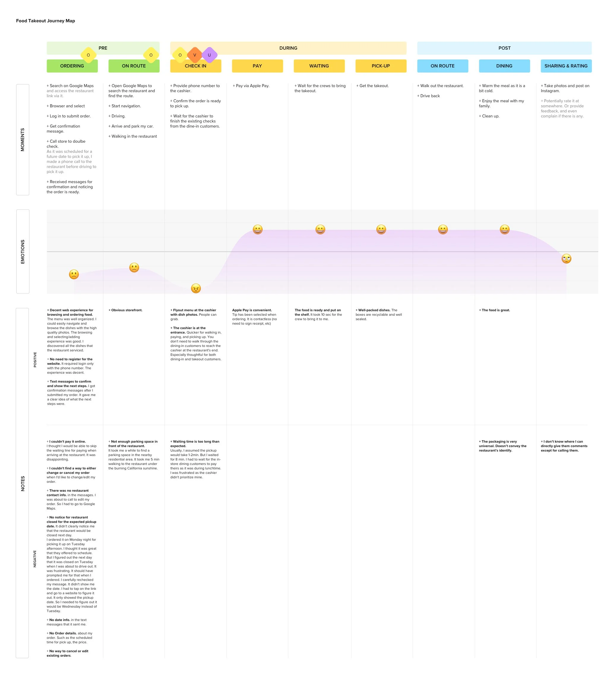
Based on my observation, I created this Journey Map. And I used the guide from the training deck to help me figure out the right challenges to work on. The guide asked me to think about the bullet points below. And mark the moments that are critical to a successful operation with an “O,” the ones that are high value with a “V,” and the ones that provide a clear opportunity to be unique with a “U.” (“Sometimes a moment represents more than one of these opportunities — that’s great! Mark all that apply.”)
Is this moment critical to the successful operation and execution of this service?
Does this moment provide a clear opportunity to be unique?
Is this moment a driver of high value for the customer, or does it have the potential to be?
Download the pdf version at HERE.
Moments that mattered
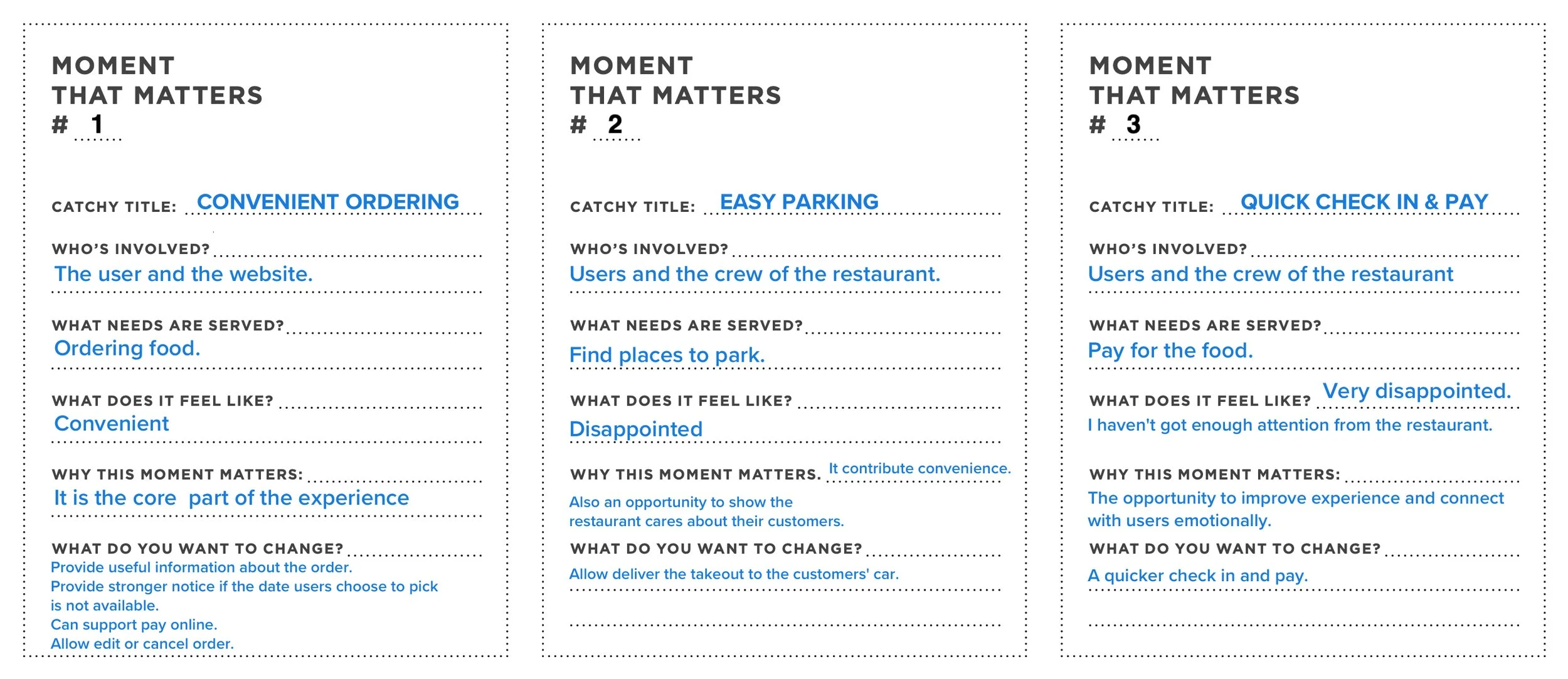
After tagging the moments, I filtered out the moments that truly mattered.
Considering the scope of this training project, I chose moment #2 and #3 to develop further.
Ideation
Goal
A convenient and thoughtful Pick-up Experience.
I chose Easy Parking and Quick Check In & Pay as the moments to design.
Prompt
How Might We make the pick-up experience more customer centered, convenient, and show the cares from the restaurant?
Ideas
Before coming, show a screenshot of the map to show where the customers can park easily.
When customers check in with the cashier, the cashier prioritize their checks to help them pay, instead of let them wait, as they are more time sensitive.
At the entrance of the shop, a kiosk that allows users to enter their phone number's last 4 digits to pay their takeout via digital payment method (Apple Pay, etc.). Then the crew will be noticed, and they will bring the takeout to them.
Allow paying online. When customers arrive, they only need to provide the last 4 digits of their phone number. Then they can quickly pick up the order. No need to wait for their turns to pay in the restaurant.
When customers arrive, call the restaurant. The crew will bring the takeout to the customer.
An app augments the experience. When customers are on route, it can let the restaurant know. When they arrive, the restaurant will know too. They will also know where they parked. They will bring the food to the customer without calling the restaurant.
Storyboard Prototype
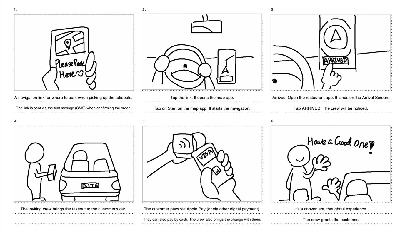
Then I chose the idea that I felt most excited and further developed it to a storyboard.
This service is an app augmented experience. When customers are on route, it can let the restaurant know. When they arrive, the restaurant will know, too. They will also know where customers parked. They will bring the food to customers without them calling the restaurant.
Test
As it was during the pandemic, I only showed the storyboard to a neighbor of mine to test our my idea and have their feedback. I expect users love the convenience and would love to use it. But I also concerned that the users don't want to download app for the service.
Overall, the feedback is positive. It met my expectation. They like not going inside the restaurant. They also like knowing where they can park. They like the link in the message. So they don't have to search the restaurant in map apps.
Here is the key feedback.
It's convenient.
I like I can stay in my car and get my takeout.
I don't like to download the app just for a specific restaurant. Why Yelp doesn't have this feature?
Why not just call them? So I don't have to use the app.
I would like to make these changes for the moments that I designed.
I'd like to allow users to enjoy the convenient service without downloading the app.
They can search the restaurant in map apps or Yelp (or other apps).
Enter a website to order the food from the restaurants via a link on that apps.
And when they arrive at the restaurants, the service will send them a text message to ask them to confirm their arrival. (Maybe this is optional if the software can make sure their arrival. But I don't want to be over-smart as sometimes it annoys users.)
When sending the arrival confirmation, it also shares the user's location with the restaurant under the user's permission. Such as the message can ask if the user allows that.
Then, the following experience will be the same with the prototype.
Blueprint
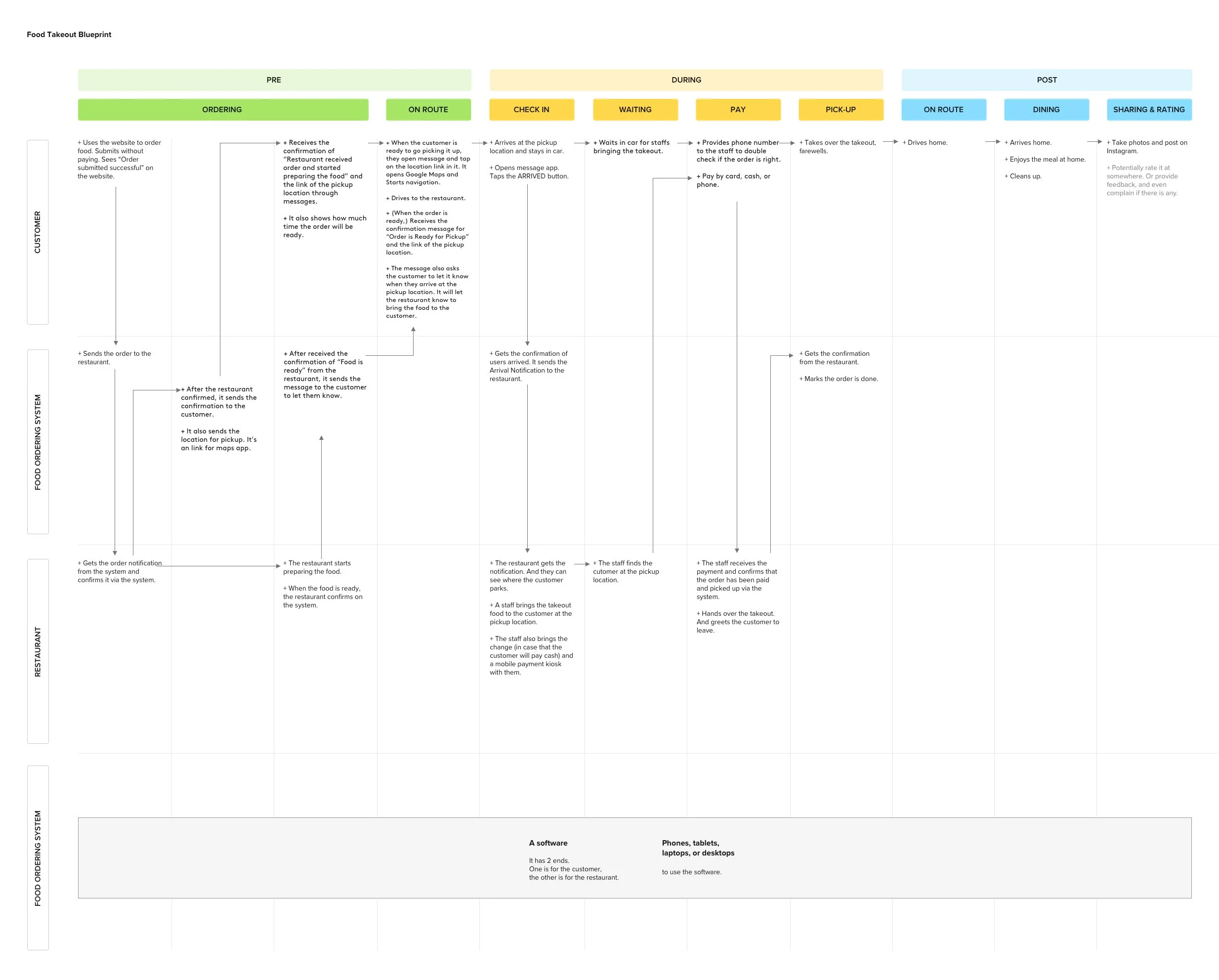
After prototyping, testing, and iterating, I made this blueprint to show the refined experience design. Blueprint is the final form of the design exercise outcome.
The audiences were the product and design teams. PMs, Designers. I hoped they would understand the high-level experience through the blueprint.
Download the pdf version at HERE.

