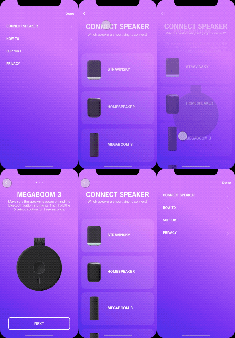
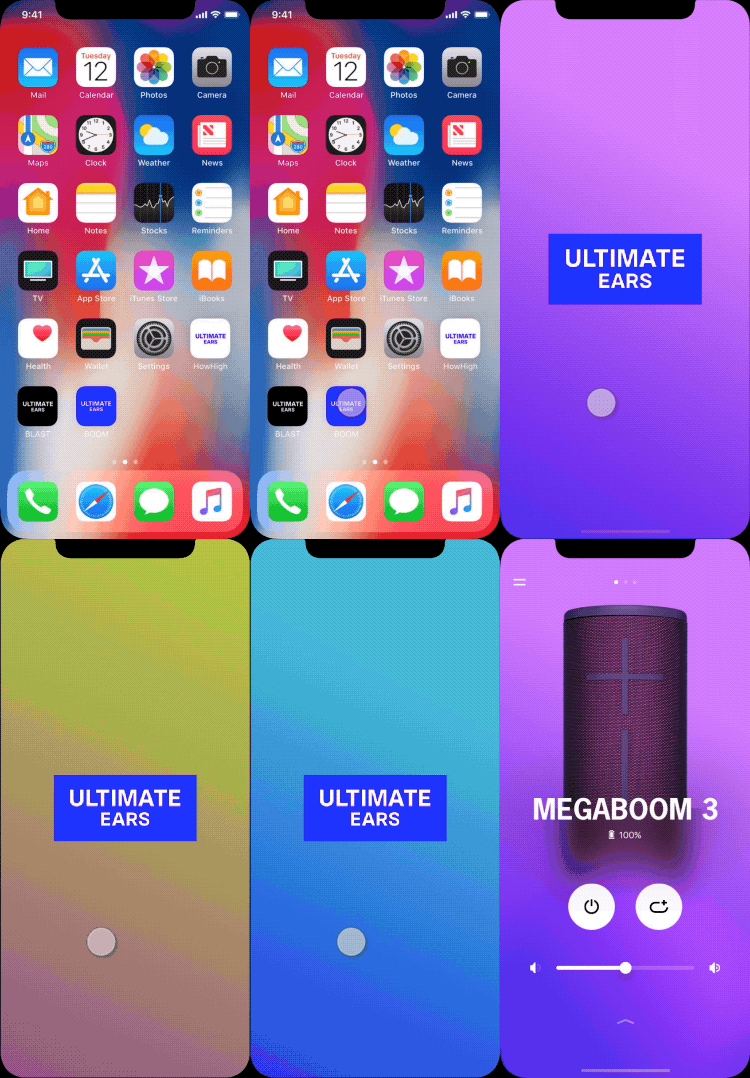
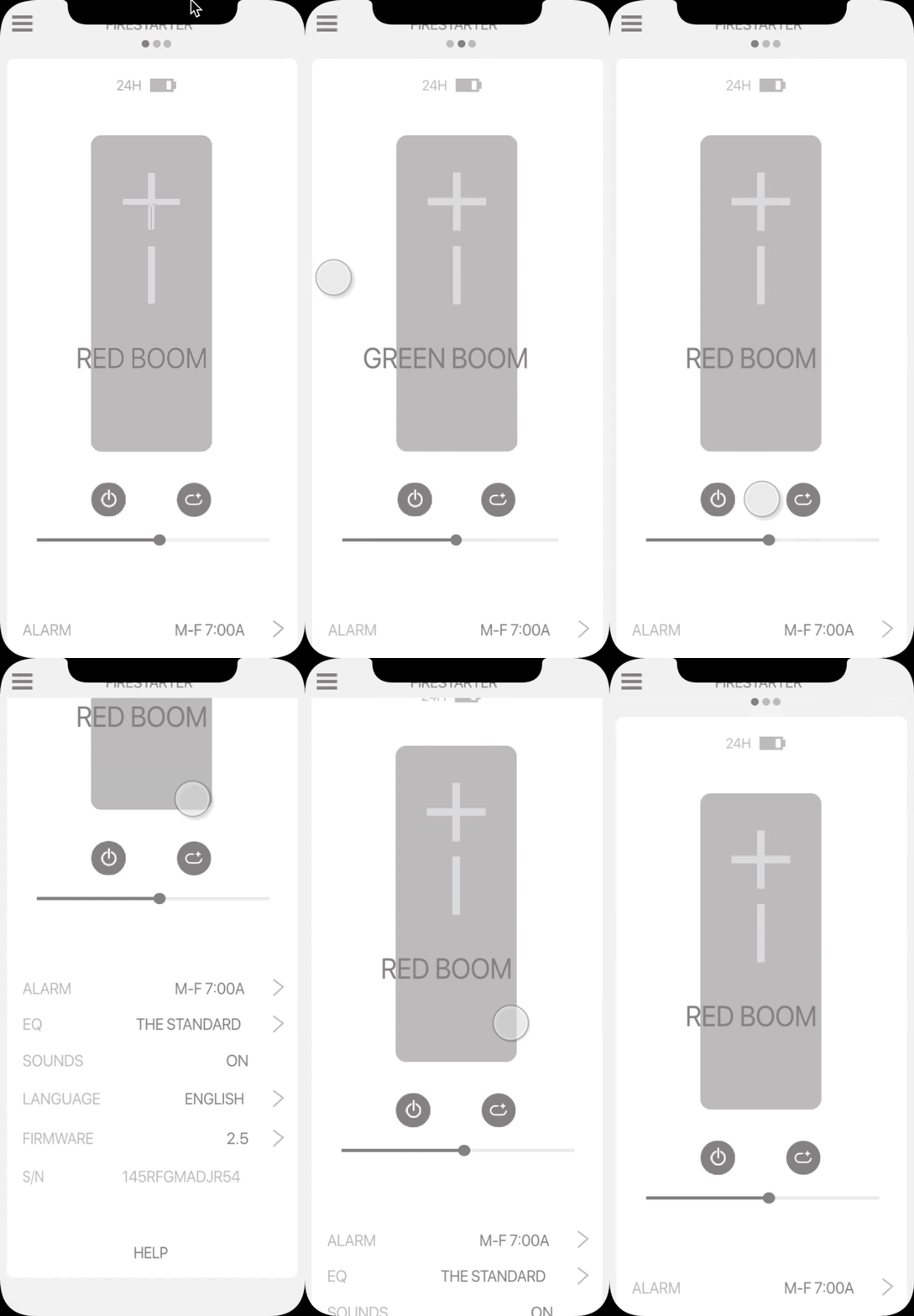
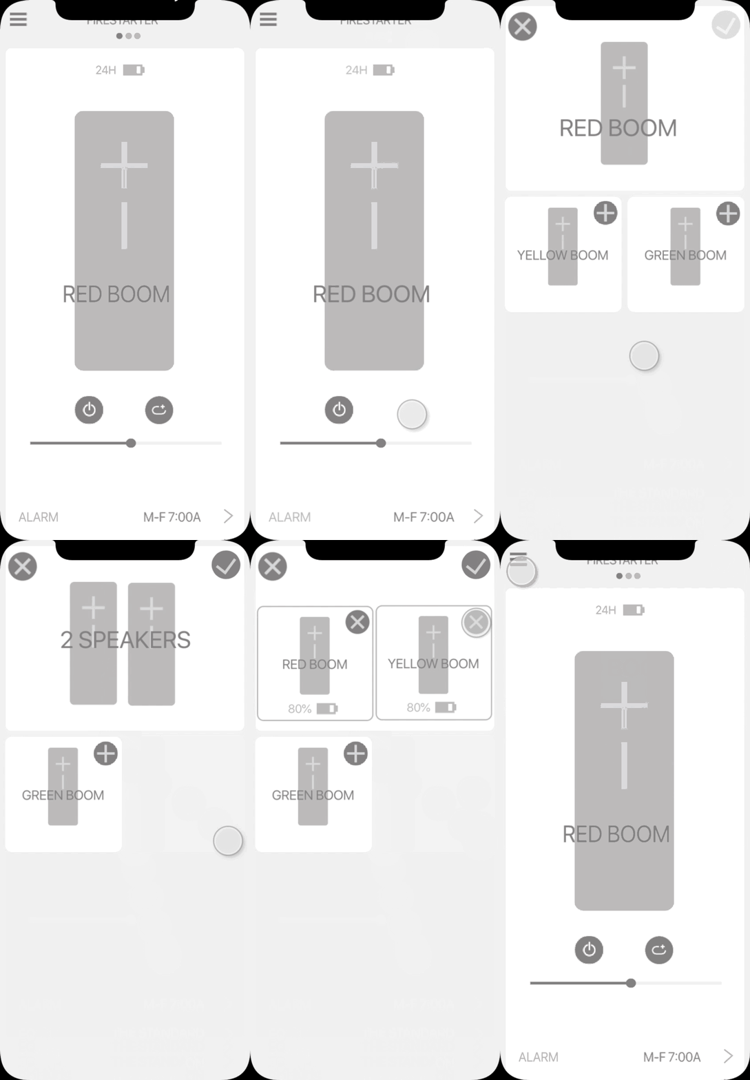
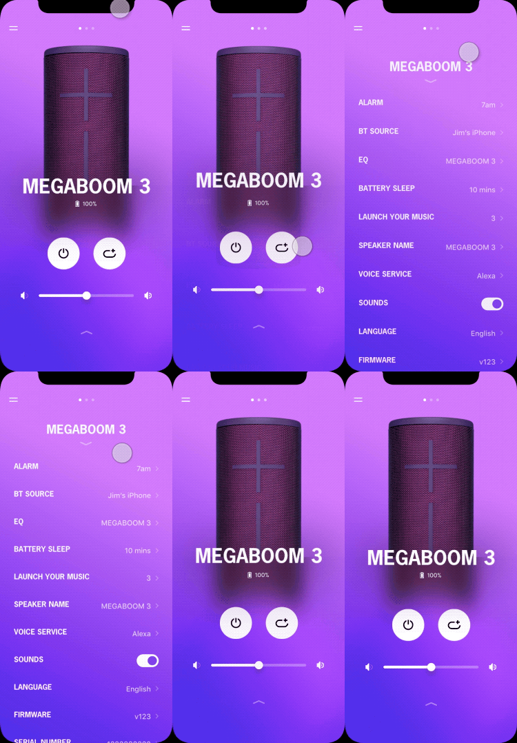
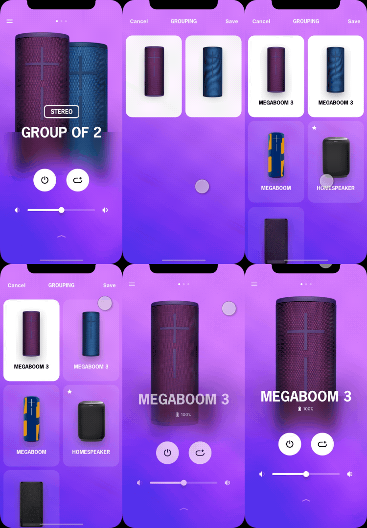
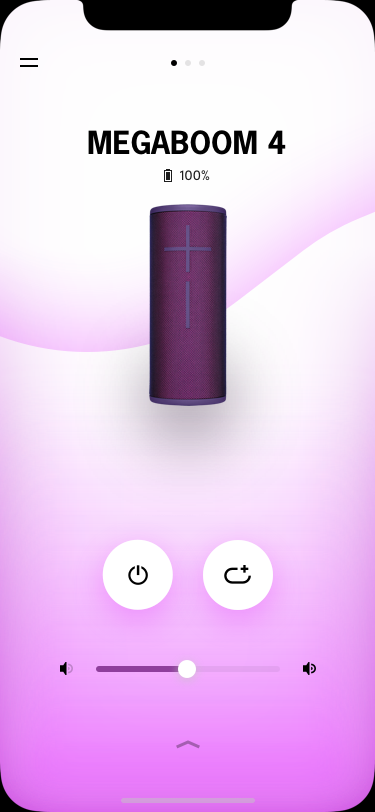
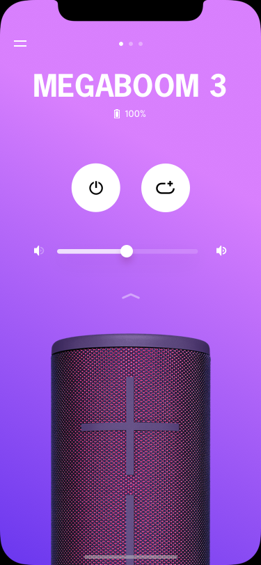
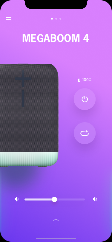
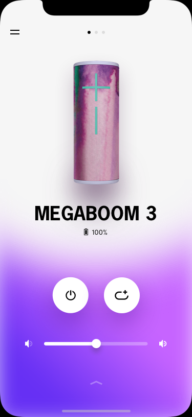
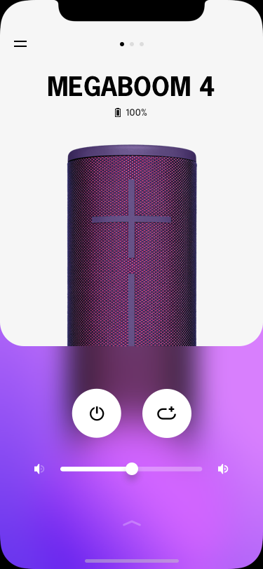
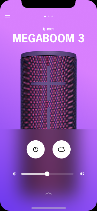
THE SINGLE PLATFORM EXPERIENCE ENABLING SEAMLESS SPEAKER ORCHESTRATION.
The ULTIMATE EARS facility app to amplify music experience.
- INTRO -
PROJECT GOAL
Redesign the ULTIMATE EARS app for allowing the hardware and software seamlessly work together to elevate users’ music experience.
MY ROLE
Lead Visual UX Designer and Project Lead.
Contributions: Product Strategy, UI Design, Interaction Design, Motion Design, User Testing, Production.
Teammates: Tiffany Larsen (Lead IxD), Andy Barker (UX Group Lead).
PROCESS
Discover > Define > Ideate > Prototype > Test > Production
INSIGHTS
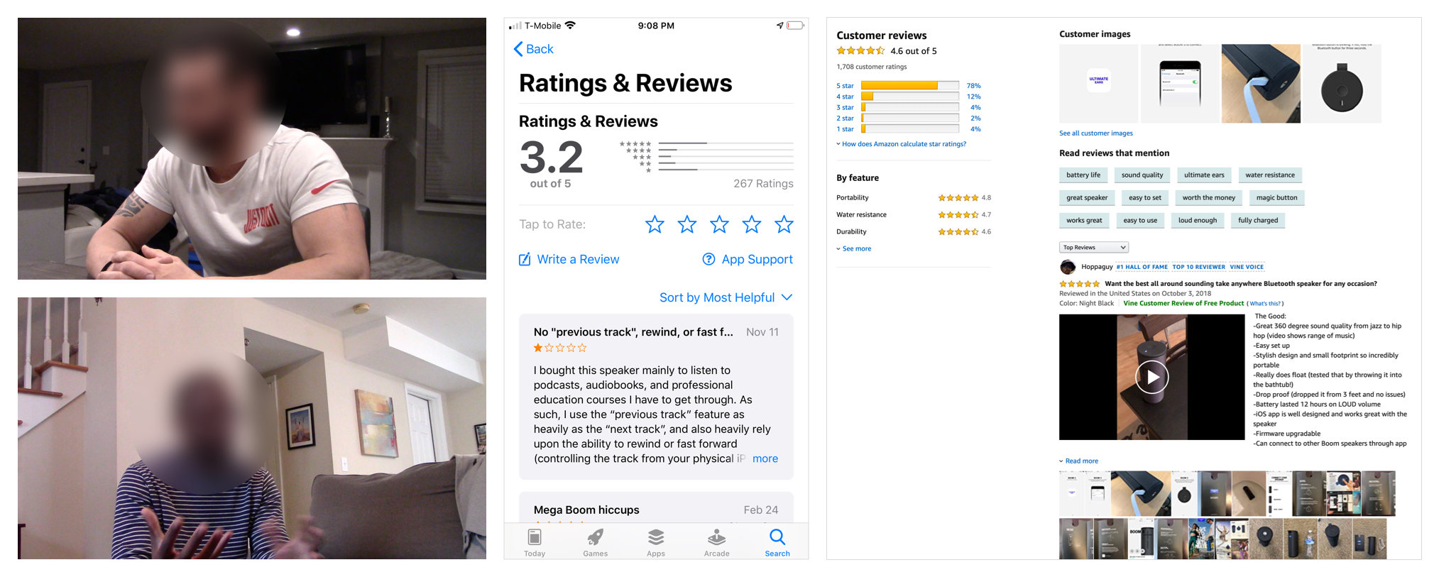
We’ve had several research projects before this project. It helps us understand our users better.
Multiple Apps
Users download the app to access more features for amplifying their music experience. But they often download the wrong apps for their speakers as we have multiple apps on the app stores.
App Structure
The app is for amplifying the music experience at users’ fingertips. But,
The existing app structure doesn't support the platform experience well.
Most of the app features presented in front are rarely used by the users.
The feature hierarchy needs to be well addressed.
Sound Experience
Users desire immersive sound and bigger music zones. They group their speakers to achieve them. But,
The grouping experience on the app is cumbersome. Besides, it is the only way they can group the speakers.
Users find it extremely difficult when sharing the speaker groups with their friends and families.
Look & Feel
The passion on music is rooted in the brand culture. We’d like to proudly advocate and celebrate the power of music. But,
The visual style for the existing apps is too quiet. It needs vibrancy and excitement.
PRODUCT STRATEGY
Based on the researches in the past months, we have the confidence to make this strategy to help us make meaningful product experience for our users.
One App
One single platform experience enabling seamless speaker orchestration.
Direct Control
Restructure the app to better enable platform experience and use data to inform which features should be front and center.
Saturated Soundscape
Help users create and share immersive sound experiences easily.
Elevated Visual Style
Reset a more exciting and alive look & feel to create an enhanced emotional experience.
UX PRINCIPLES
Discoverability
A pared down, pure and elegant architecture. Every feature is easily discoverable in context, without searching, requiring less actions to get to key functions.
Predictability
Key features are all readily accessible at the top level; Patterns and transitions are consistent across all touch-points. Adopt a crystal clear language strategy.
Clarity
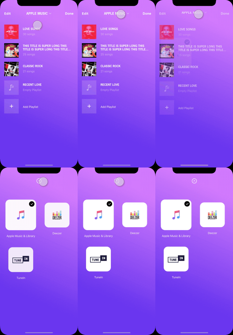
The digital experience has a defined purpose, drawing a distinct line between our capabilities and 3rd parties - We are not a music UI.
Physical First
All key functions are accessible on the speaker, but enhanced by the application.
One Family
Future NPIs work as one family, accessible through one application
Scalability
Flexible architecture that can accommodate both new and legacy speakers in a single location.
Brand Framework
Alive. Positive Irreverent. Creative. Playful. Authentic. Social.
SUCCESS METRICS
Here are the possible metrics in my mind to validate our design.
App Navigation
Users find the app easy to navigate.
Grouping
Users find it easy to group speakers, and they prefer the permanent speaker groups over ad-hoc groups.
General Ratings
Amazon rating: 4 stars out of 5.
App Store and Google Play ratings: 3.8 out of 5.
DEVELOPMENT ROADMAP
RC RELEASE
https://www.youtube.com/watch?v=-VThp2uHcXw
Although it hadn’t been released eventually. But the design concept survived. It was accepted by Logitech Gaming group when I worked on the mobile app for a Logitech G earbuds. Here are the screenshots. Link.
- EXPERIENCE DESIGN -
ELEVATED LOOK & FEEL
A meaningful product experience should have a clear reason for being, fine tuned usability, and resonating aesthetics.
Visual experience plays a big part in. It helps the product connect with users emotionally. To have deeper connections with our users, we’d like to resonate with them through the app’s new look & feel.
Problem
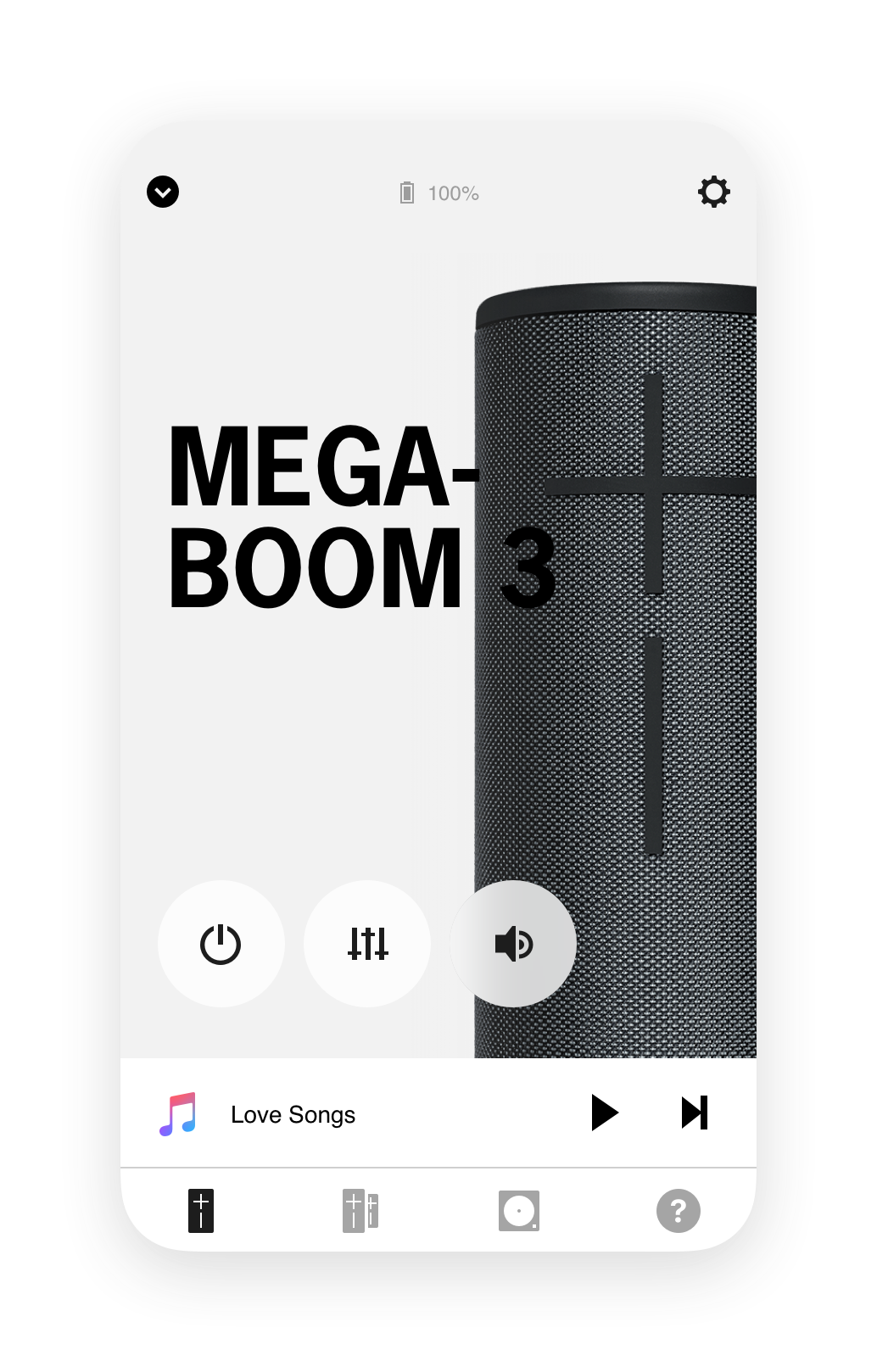
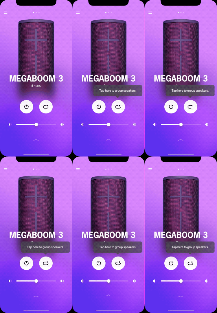
As the current app look & feel is over calm and quiet, we’d like to present ourselves in a more energetic and exciting vibe. (The screenshot at the left is from the legacy app.)
To better service that, we must ask ourselves WHAT DO WE STAND FOR. We should proudly present ourselves, advocate and celebrate what we believe in. Quoted from Brand Guideline, “WE EMPOWER YOU TO SPONTANEOUSLY TRANSFORM YOUR WORLD WITH MUSIC”. Per the brand guideline, the brand should have these characters, ALIVE, IRREVERENT, CREATIVE, PLAYFUL, AUTHENTIC, SOCIAL. I started with presenting multiple visual directions and eventually, we aligned on this final concept: This Is Me. Ultimate Ears!
This Is Me. Ultimate Ears!
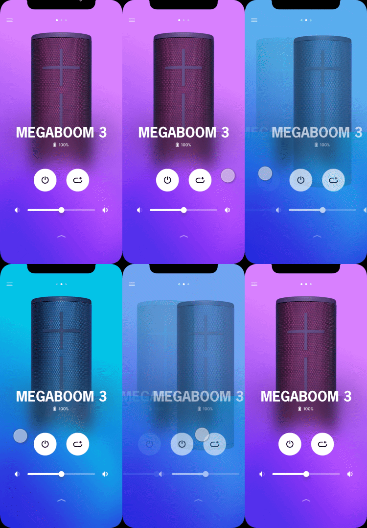
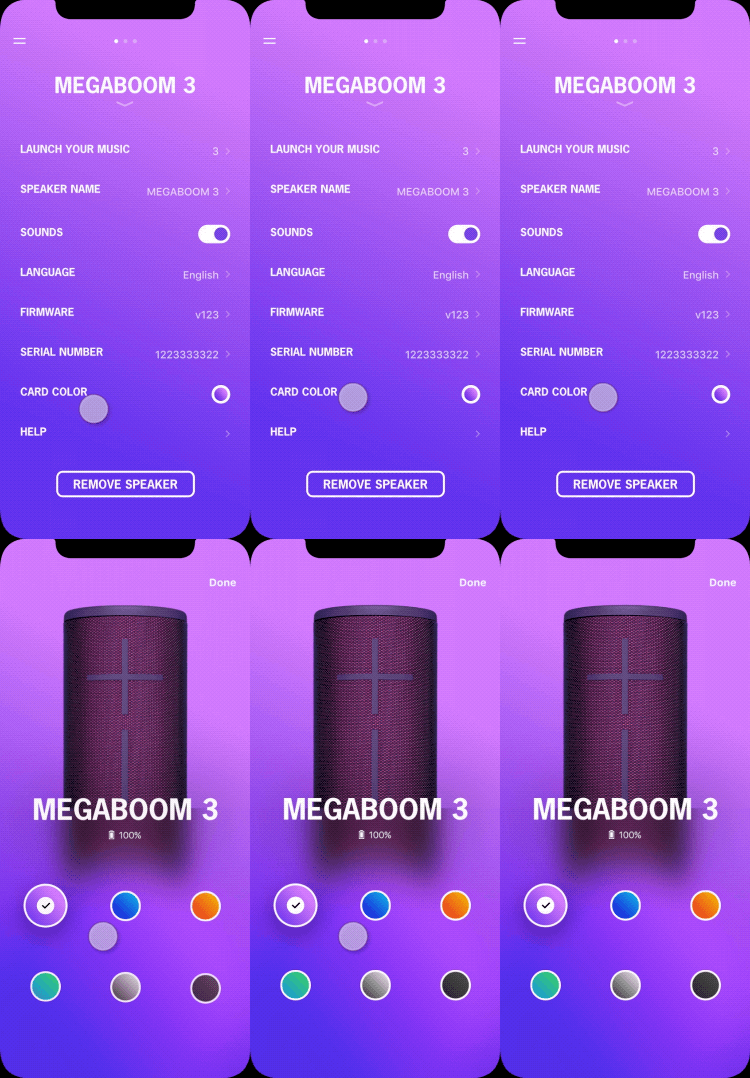
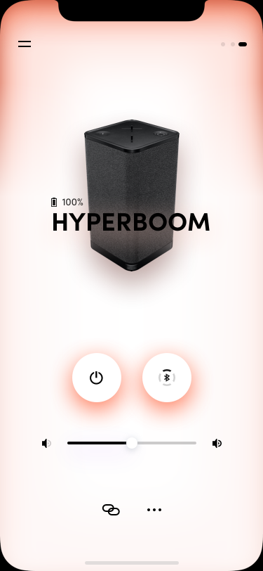
Except for the purple theme, there are the other 5 colorways that the users can choose from. The rest colorways will be automatically applied to the newly added speakers.
Easily change the background color in the settings.
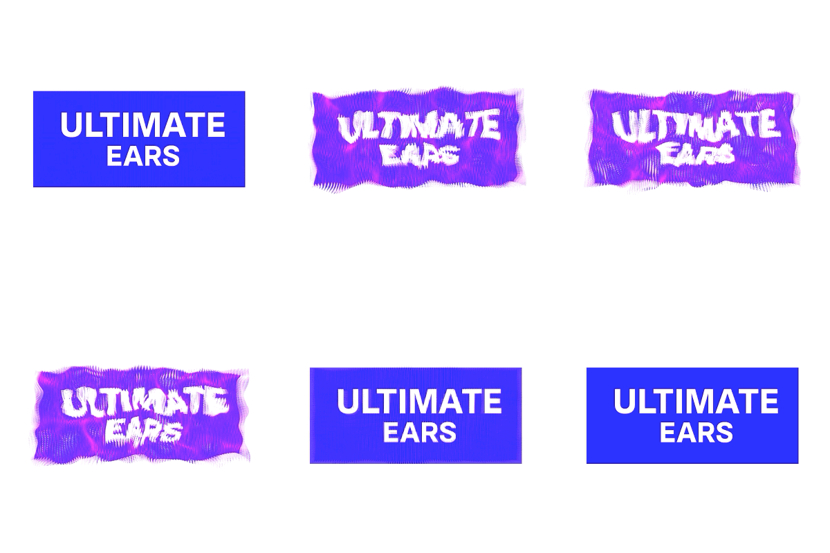
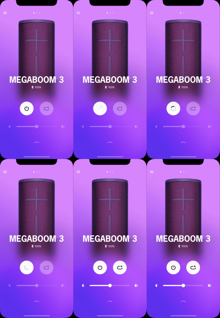
To bring more liveness to the app, I did a quick 2 weeks motion study for the screen and icon transitions.
DIRECT CONTROL
Through the previous researches, we understand why users use our app.
Prioritized User Goals
1. Set up speakers (WiFi speakers) and speaker features. Set it and forget it.
2. Remote power speakers.
3. Group speakers for the immersive sound experience.
4. Configurate speakers.
Simplified App Structure & UI Layout
Problem
The legacy app doesn’t support the experience well.
The features are piled up on the screen without a carefully defined hierarchy.
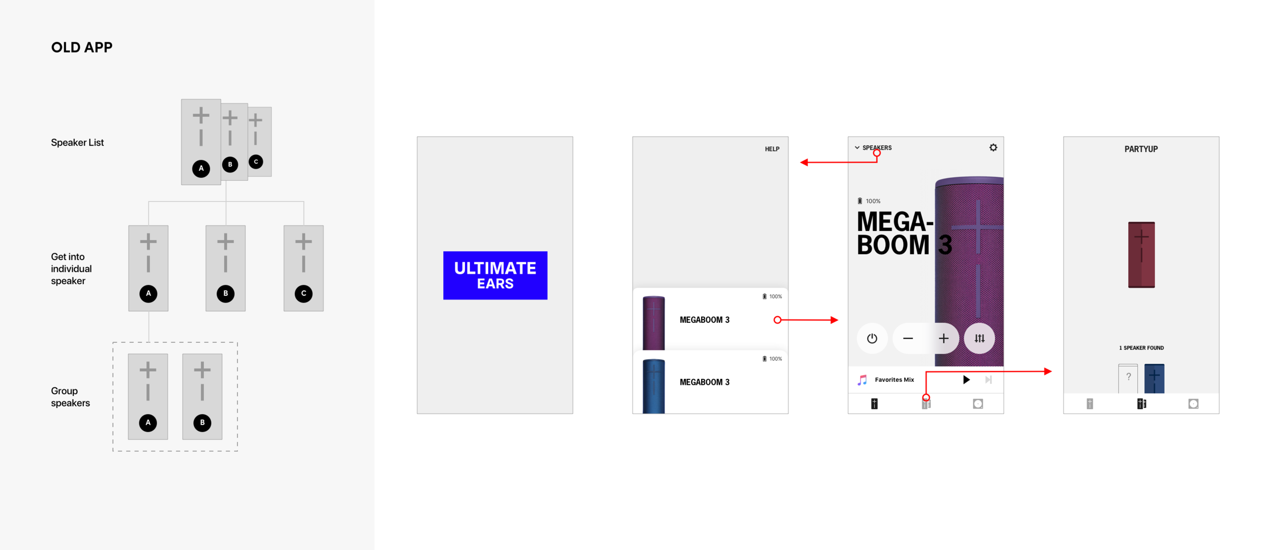
To switch between speakers, users have to bounce between speaker list screen and speaker screen.
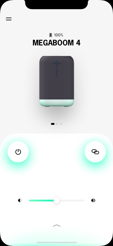
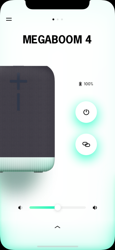
To better help users achieve the prioritized goals, we came up with this new structure.
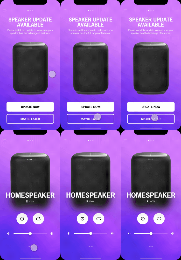
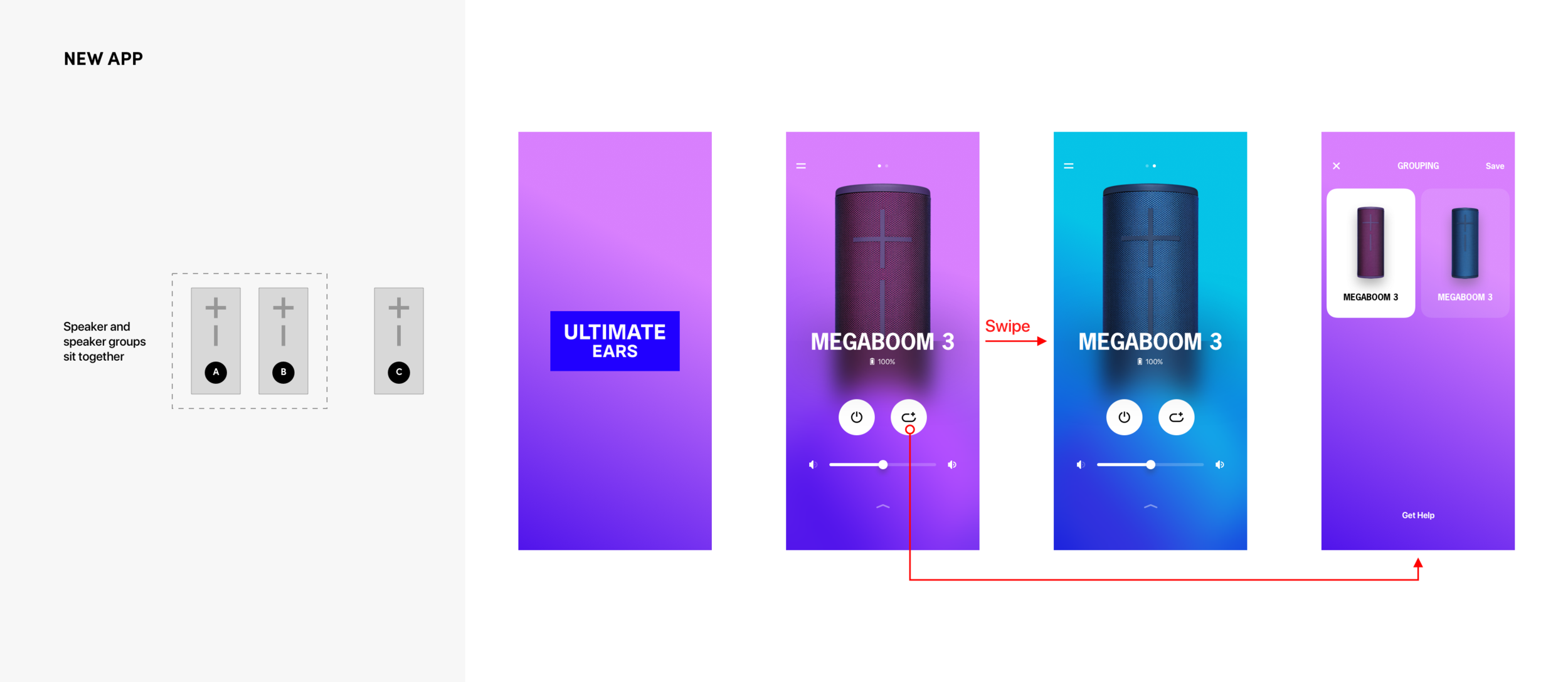
1. Flat App Structure
Easy jump between speakers by swiping horizontally.
2. Remote Power
The most frequently used feature.
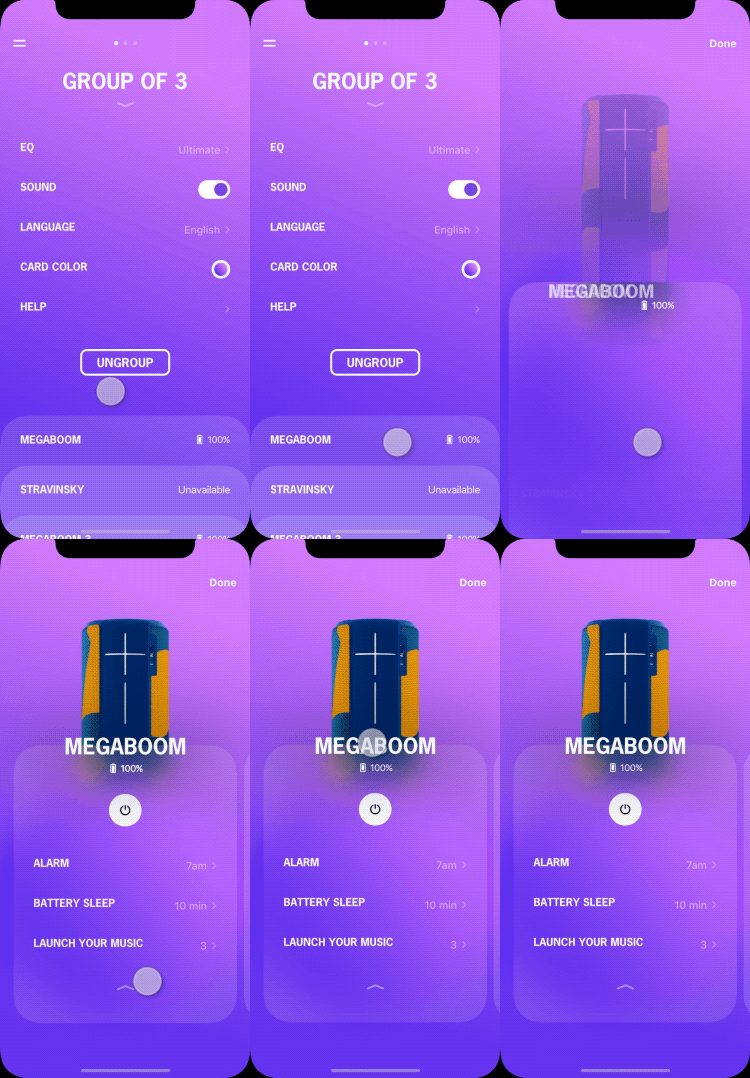
3. Grouping
The transformative feature that we’d like to promote.
4. Volume
The must have.
5. Full Customization.
Swipe up. They will show up.
Clear Navigation
Easy access to the speakers and the speaker features just by swiping. It’s intuitive and more fluent than tapping buttons and icons.
Swipe left and right (on x-axis) to switch between speakers.
Scroll up (on y-axis) to check the other speaker features.
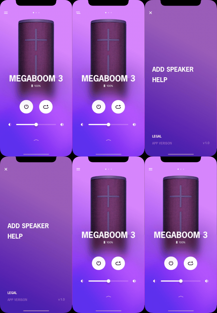
Tap the MENU icon. The app features come from the z-axis.
Effortless Interaction
The primary features are reachable by thumbs. Accessing the global app features needs more effort. But they are much less used by the users. It’s fine to put it at the top left corner.
GROUPING
Permanent Speaker Groups
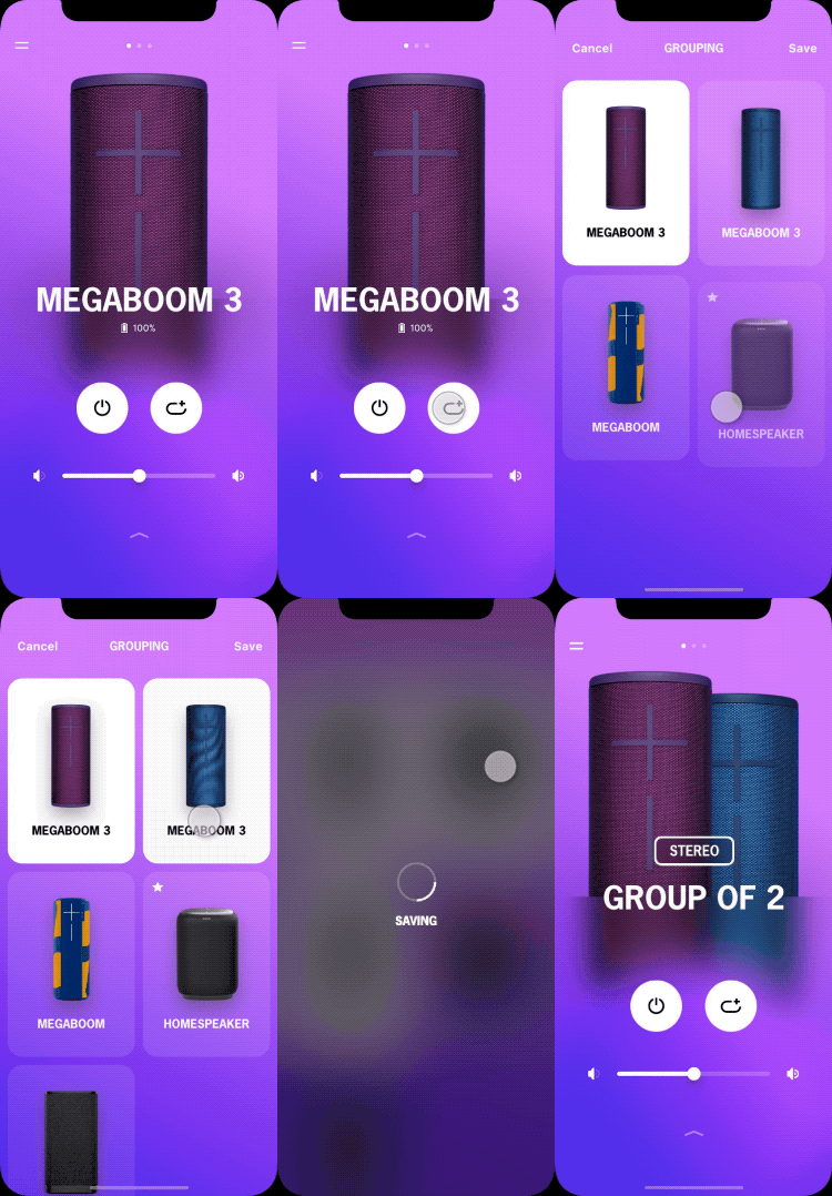
Based on what we have learned from the users through the in-field researches, we prioritize the needs of permanent groups. “Group it and forget it”. Users only need to group the speakers once. For the next, just one tap, the speakers will come back to the group.
Easy Sharing
To help users easily share the speaker groups with friends and families, they can connect any speaker within the group to play music on all of them. Besides grouping through the app, users can group the speakers through the grouping buttons on the speakers (only available on the new-gen speakers)
Easy to group
Instead of using a configuration list (such as Sonos or Apple’s Airplay 2), we'd like to make the user interface more engaging and fun to use.
The speaker group is permanent. They just need to group them once.
Easy to ungroup
For users that only need temporary groups, they can easily ungroup them.
INTERACTION DESIGN
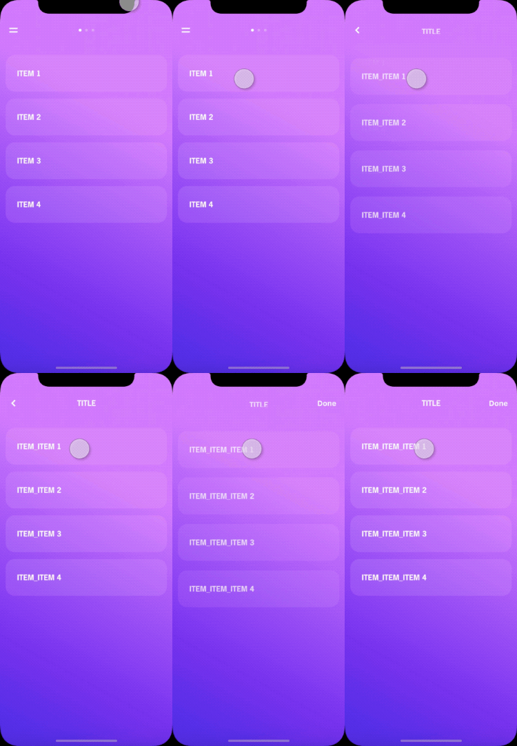
I was the visual UX for this project. But we still inherited a lot of old flows from the old app which majorly are designed by me. Here are some examples that I handed off to the engineers.
STYLE GUIDE
Here is the one that is handed off for production.
- PROCESS -
MAIN STRUCTURE AND NAVIGATION
It's cumbersome when switching between speakers under the old app structure. And the grouping feature is buried in the 3rd level screen.
Benefitting from the new structure, users don’t need to go back to the speaker list when they want to switch speakers. And the grouping feature is put more front and ready.
Prototype & Testing
We made several prototypes for internal reviews and feedback. Then we went for an user testing with the one we aligned on. Here are learnings from the user testing.
✔ Switch speakers
Users naturally swiped the screens to switch speakers.
! Find other speaker features
Users don’t know there are more items at the bottom. However, most users eventually figured out. They naturally brought up the solution: use an arrow to indicate swiping up.
✔ Group Speakers
Users don’t know what the grouping icon means. But they figured out after getting into the grouping screen.
✗ Ungroup Speakers
Users couldn’t figure out how to ungroup speakers as the UI is too hidden.
Iteration
Based on the learnings from the user testing. We iterate our design with the Hi-Fi UI mockups.
An arrow at the bottom.
Users swipe up the screens as they see it.
Less “playful“. But still fun to use.
We finally aligned on the more straight forward version although less playful. Users can clearly know how to ungroup speakers.
We tested again through the new prototype with the Hi-Fi mockups. The feedback is very positive. We decided to move forward with this design. And we also decided to add tooltips to help users get familiar with the app better.
Tooltips
For the first time that users come to this screen. Tooltips show up to help users get familiar with the app.
Others
UI explorations coming out from the process.
GROUPING
Based on the understanding of our users' real needs and experience, I created storyboards to help us discuss and prioritize the hero use cases. Finally, we defined the PERMANENT group as the primary and AD-HOC group as the secondary.
Primary Use Case
Secondary Use Cases
Solutions
Group speakers without the app
We brainstormed multiple solutions for grouping speakers without the app. Considering feasibility and the prioritized use cases, we chose this one as the FINAL SOLUTION as it can help users easily group speakers and ungroup speakers for both permanent and ad-hoc needs.
Here are the other interesting ideas.
The WIP prototype for the selected solution.
Group speakers through the app
Multiple UI solutions coming up from the process.

